Bell Court
How we gave a new face to Shakespeare’s local market.
Advertising, Brand Identity, Creative Campaign, Hoardings, Storytelling, Wayfinding, Website
- Advertising
- Brand Identity
- Creative Campaign
- Hoardings
- Storytelling
- Wayfinding
- Website
The Problem:
In the heart of Stratford-upon-Avon, Bell Court had reached an important turning point. With the arrival of The Ivy Brasserie, a growing pipeline of new residential developments and an evolving local demographic, the existing brand no longer reflected the quality of the destination or its future ambition. The challenge was to refresh the identity to attract younger professionals while continuing to welcome its loyal customer base — strengthening footfall, enhancing tenant appeal and supporting long-term asset value.
The Story:
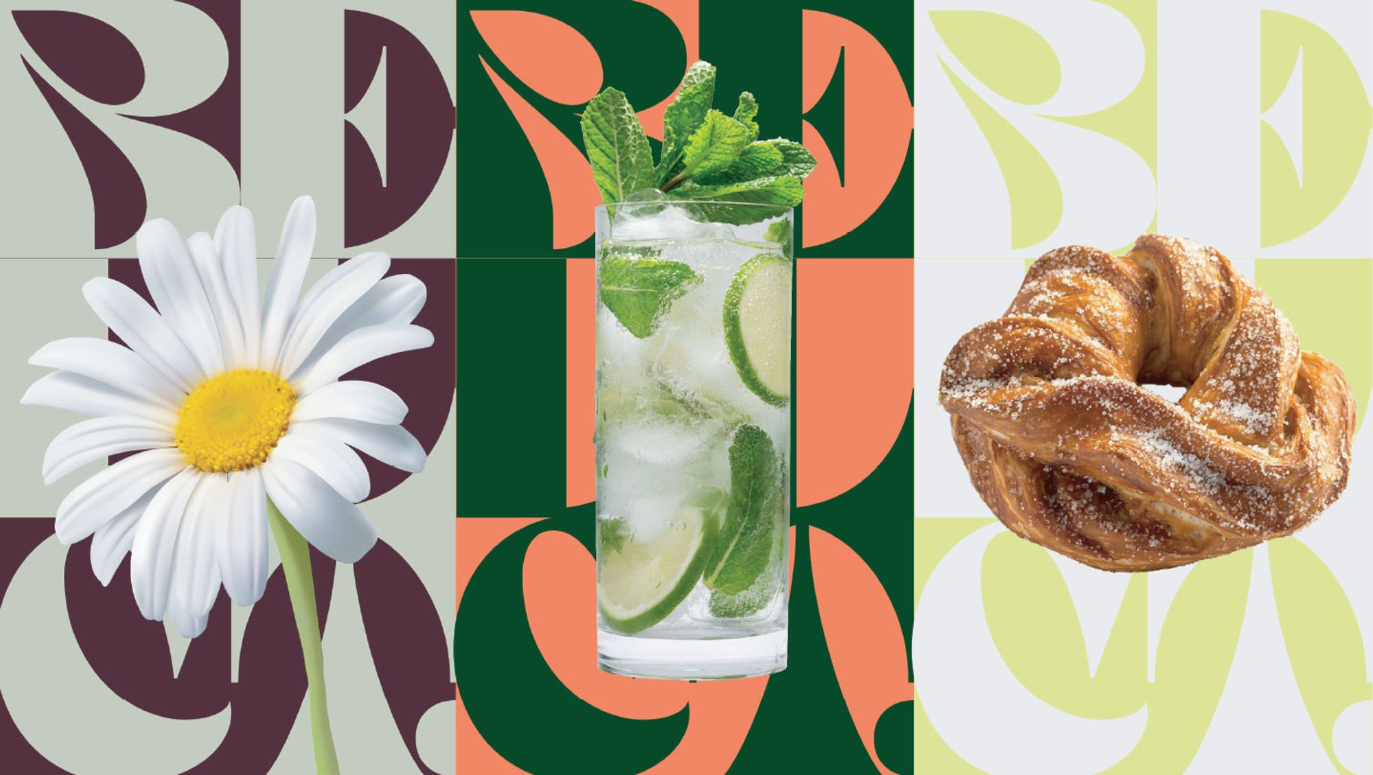
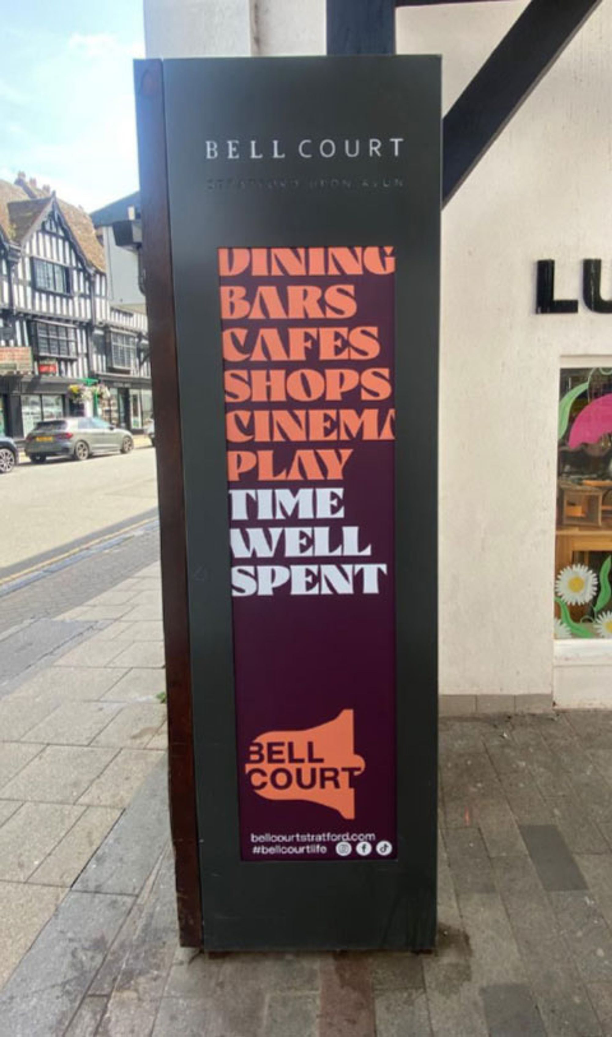
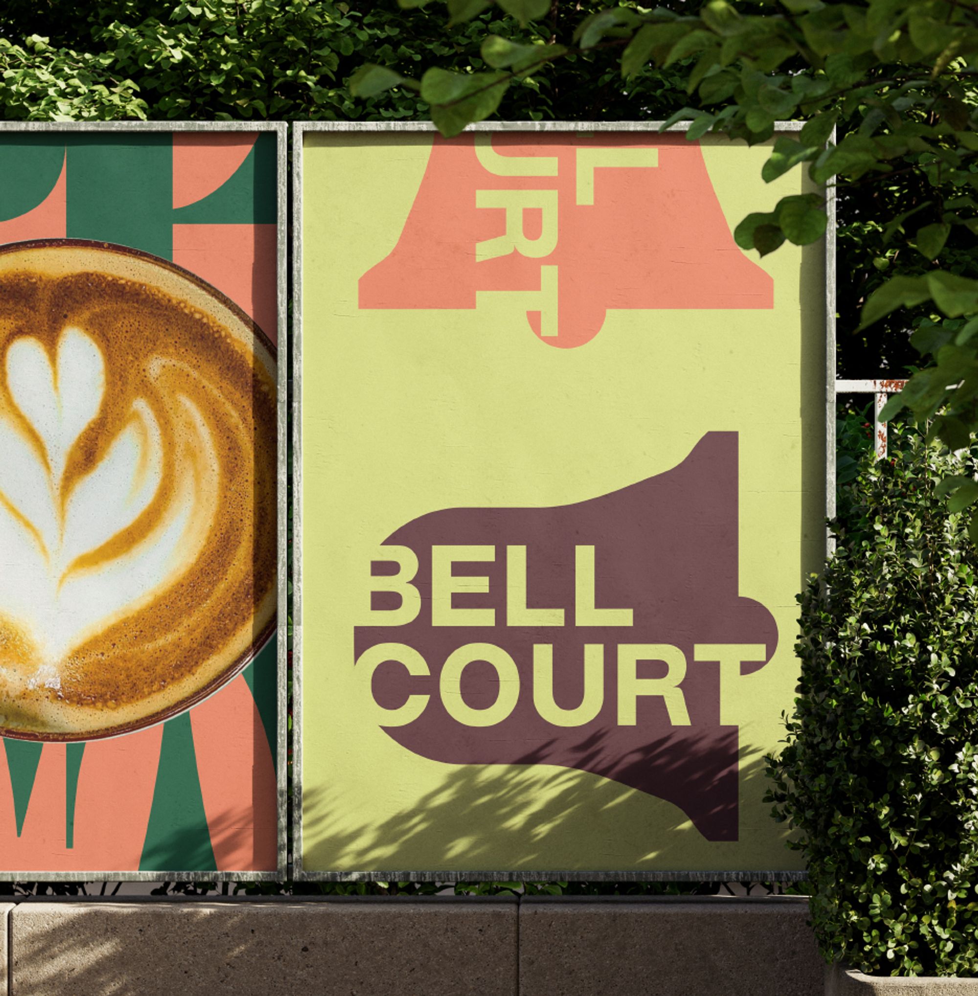
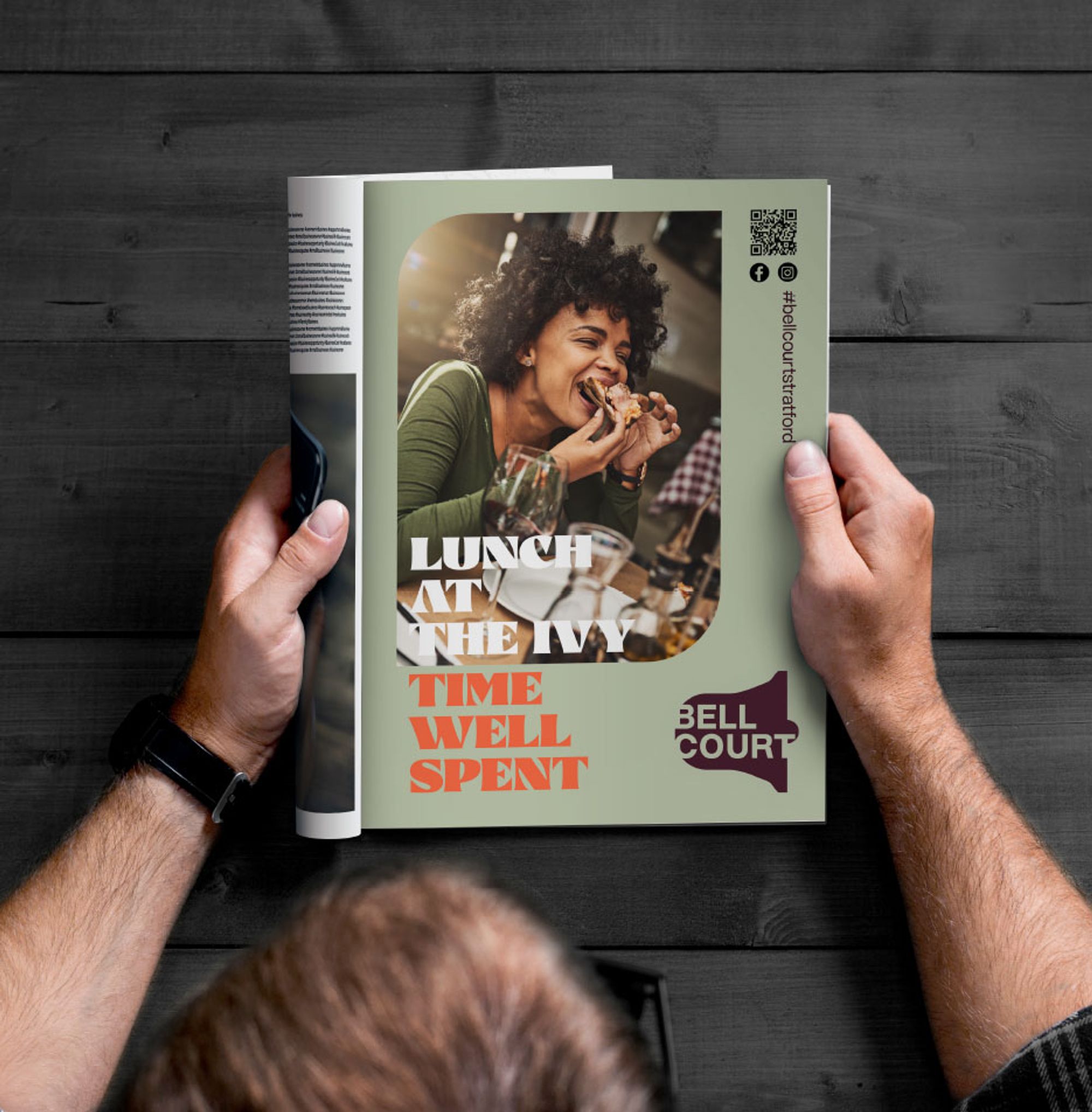
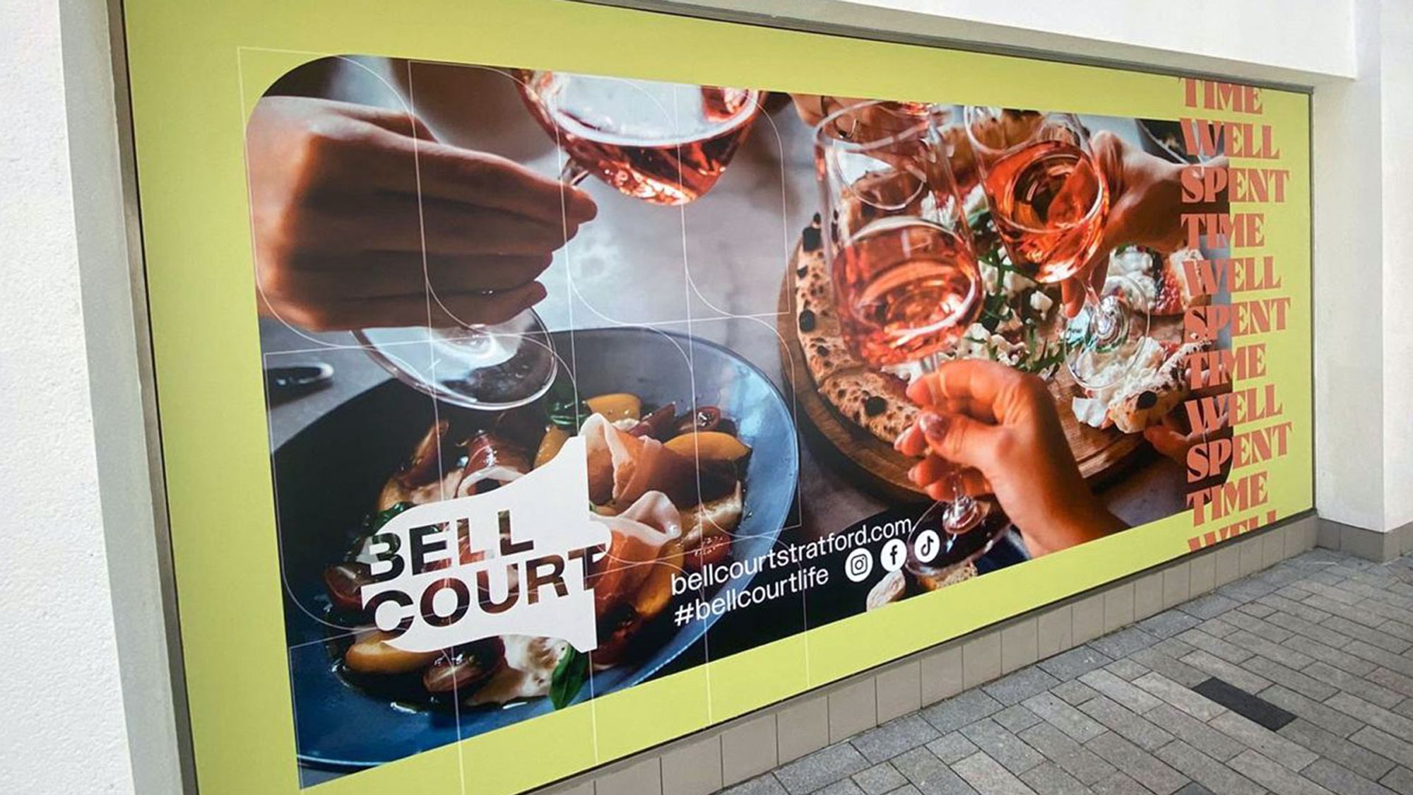
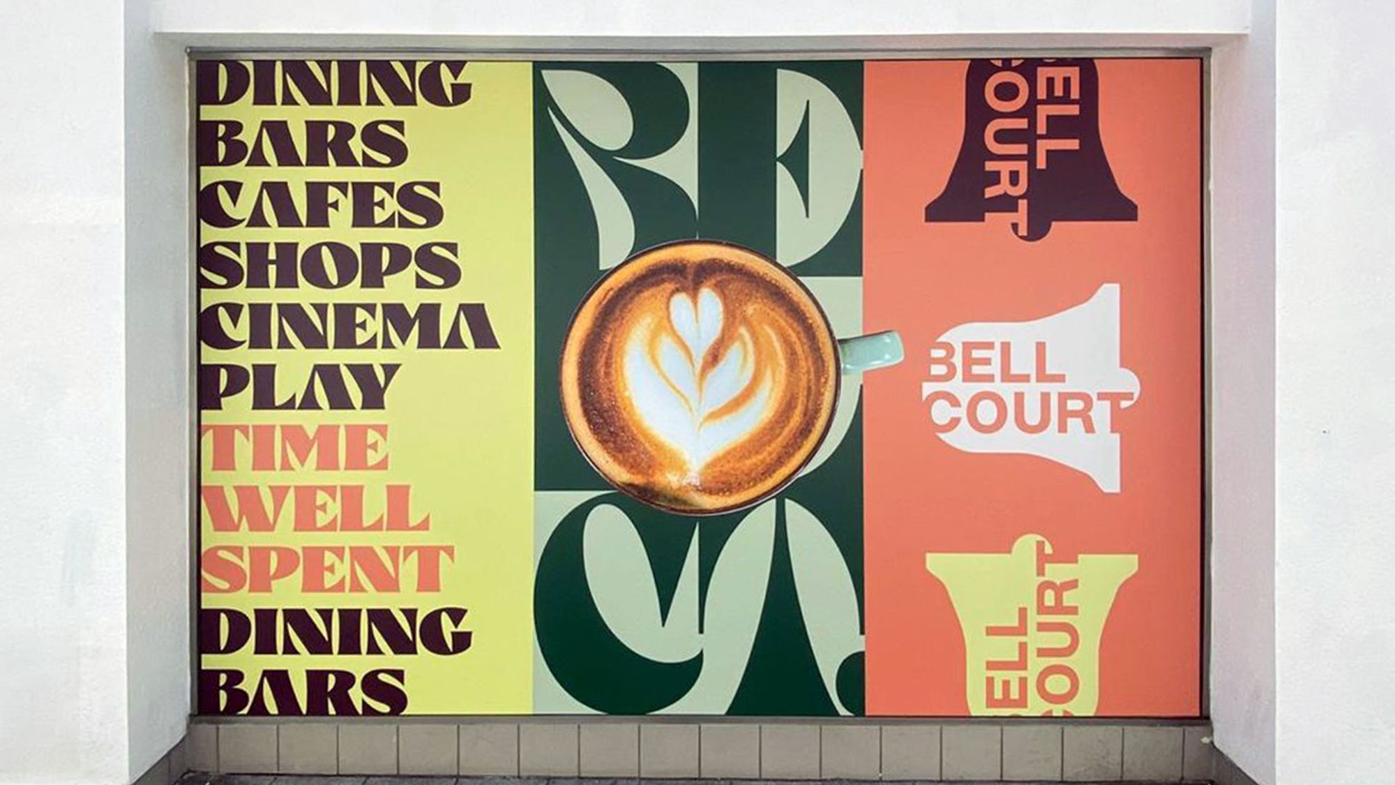
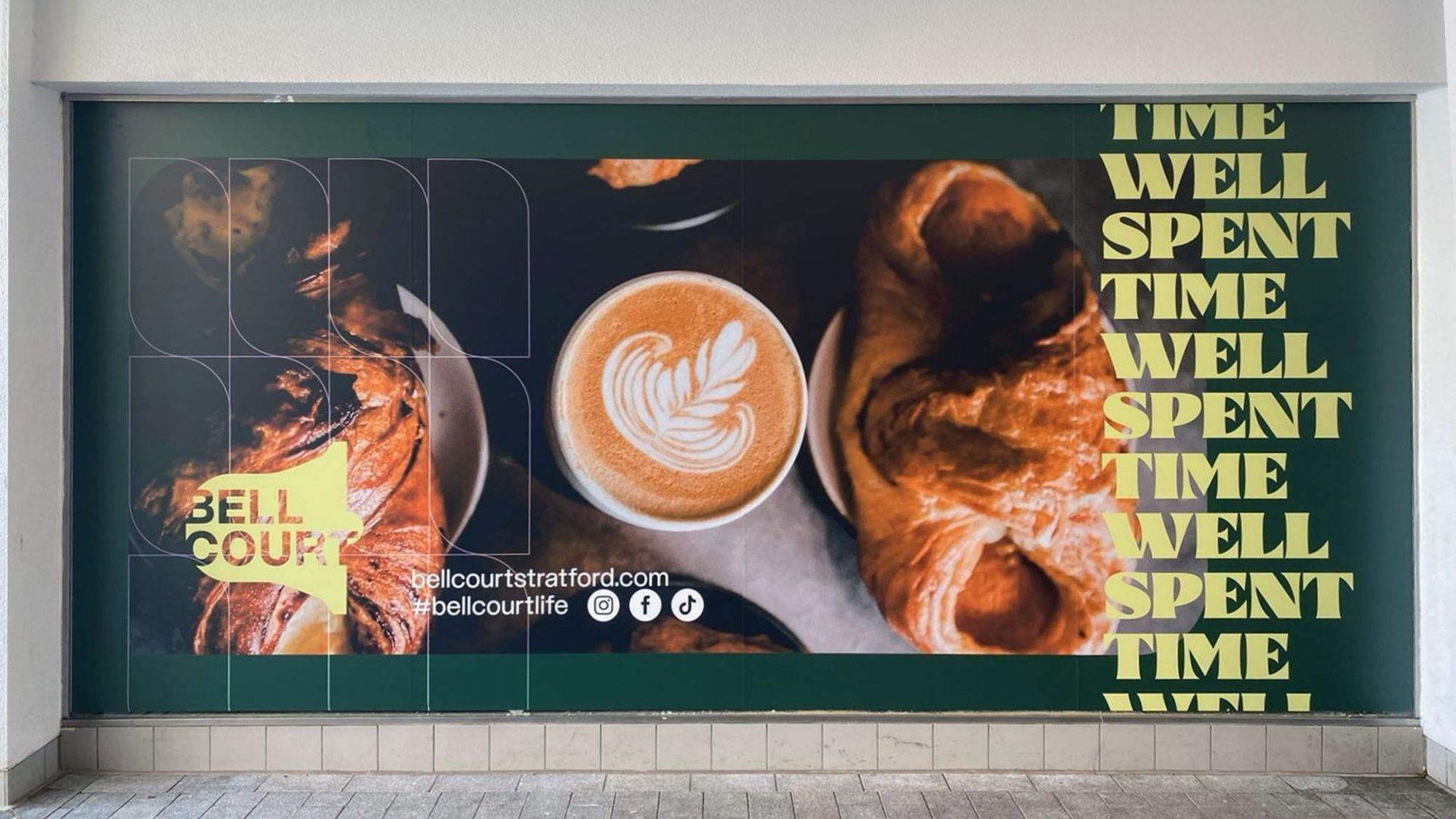
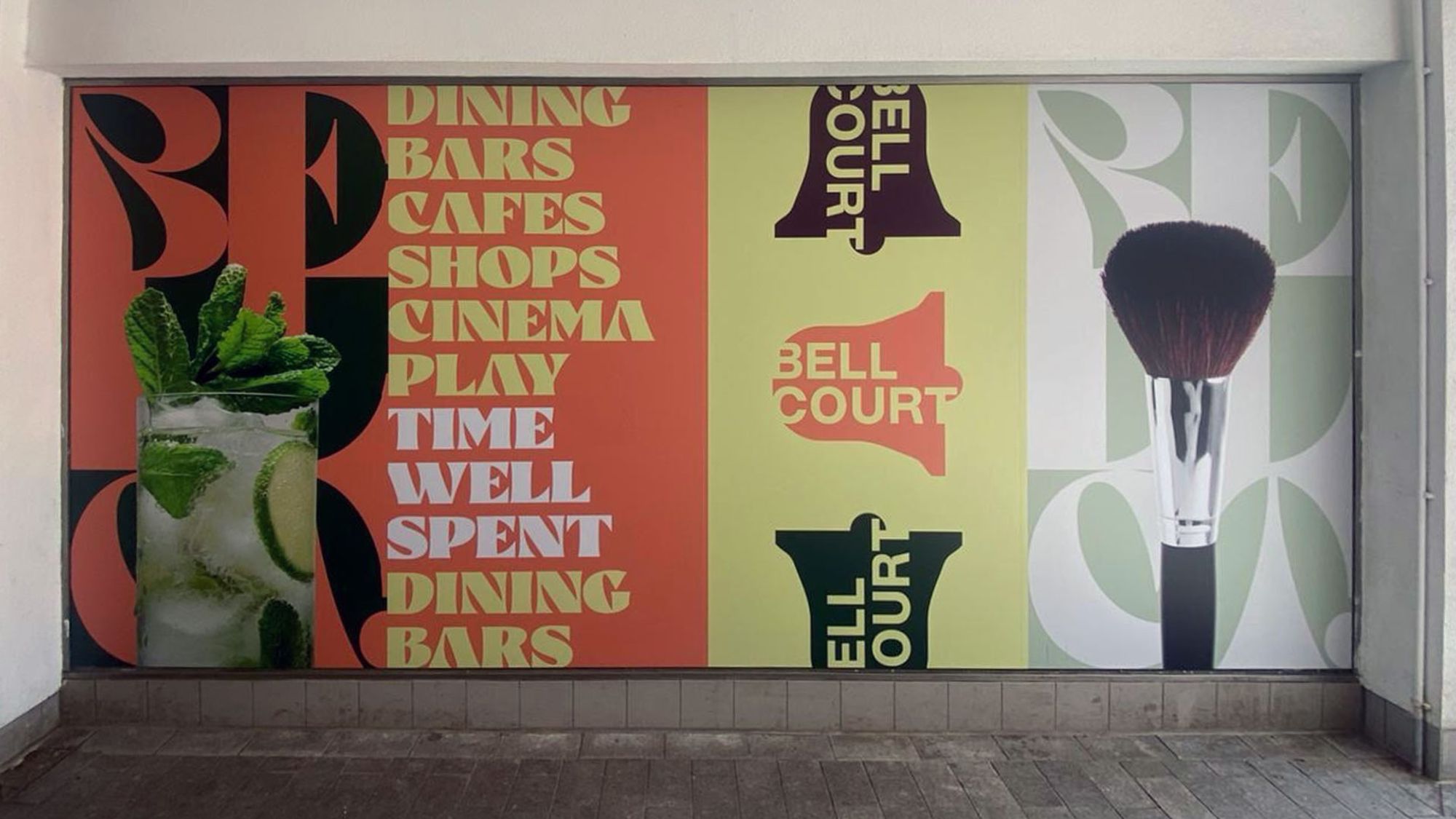
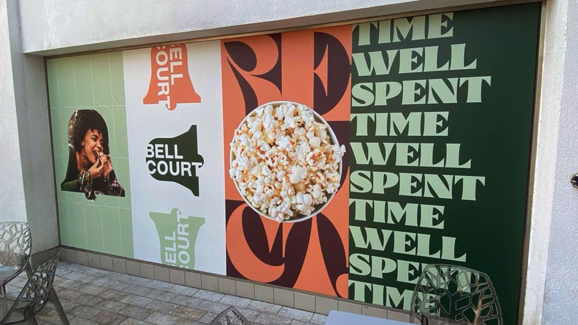
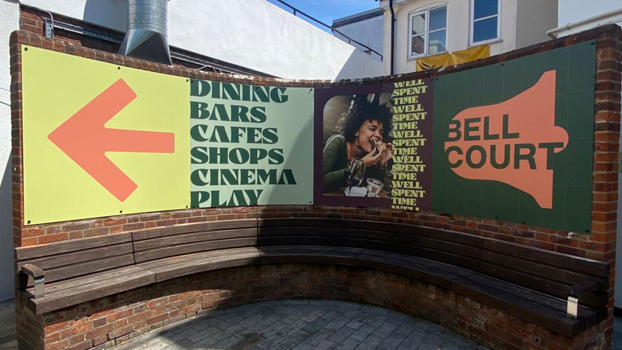
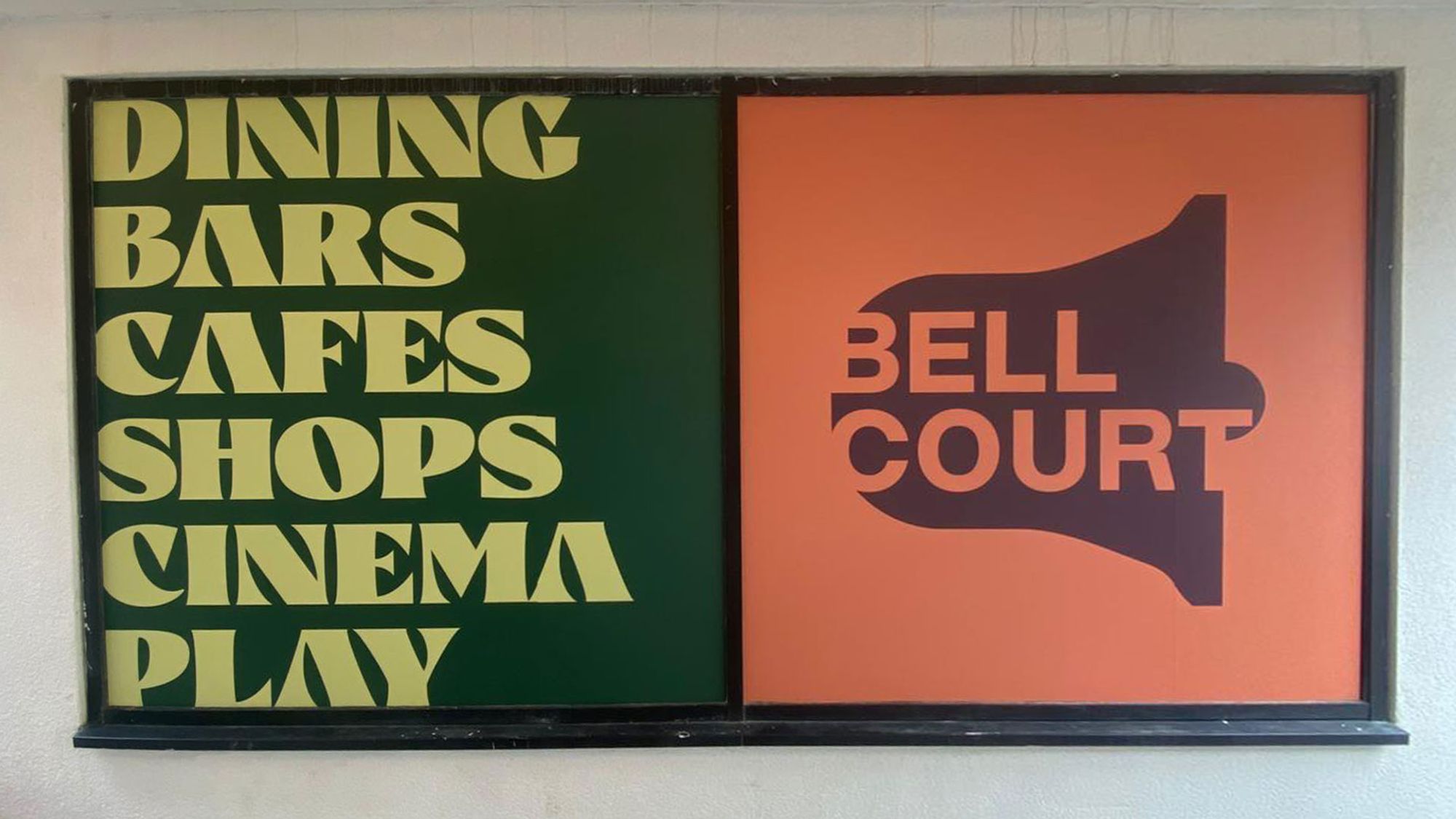
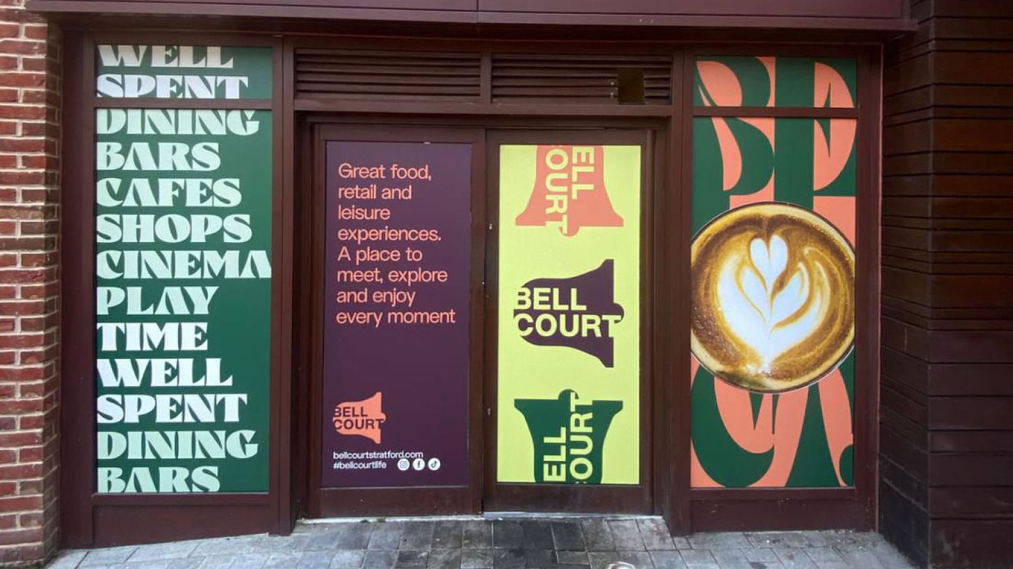
We repositioned Bell Court with a bold, contemporary identity. A refined logo, fashion-led colour palette and distinctive 70s-inspired typeface created a premium high street feel.
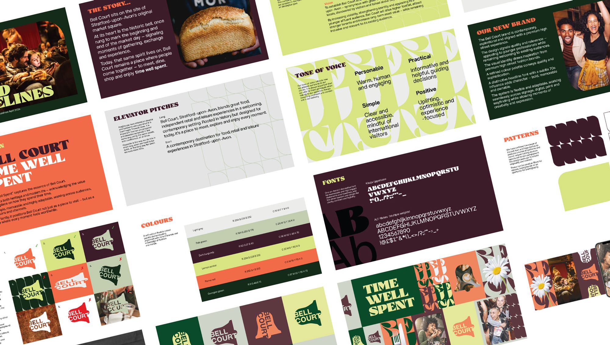
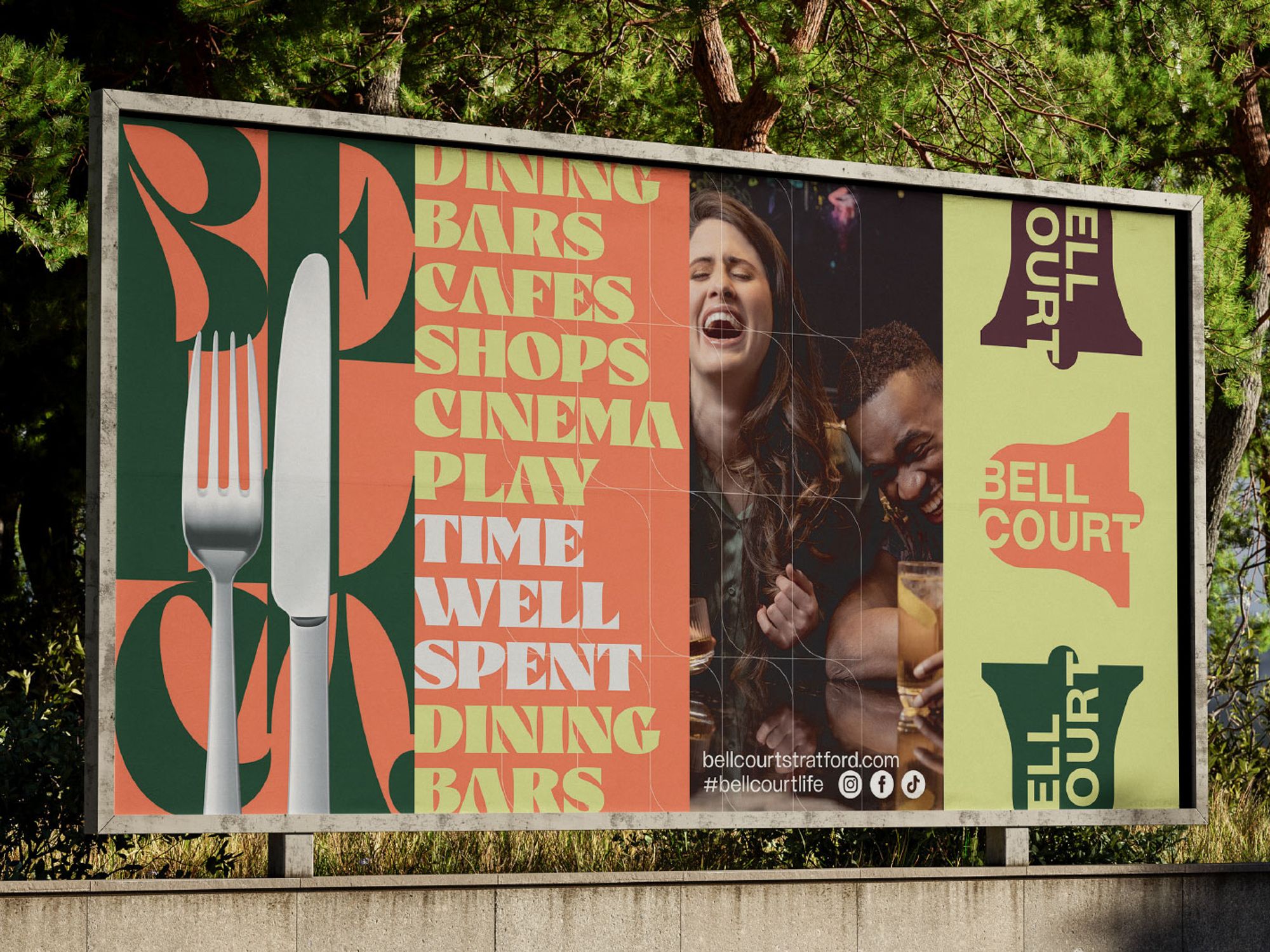
Anchored by the line ‘Time Well Spent’, the brand celebrates meaningful experiences across dining, cinema and shopping – modern, confident and memorable.
The Result:
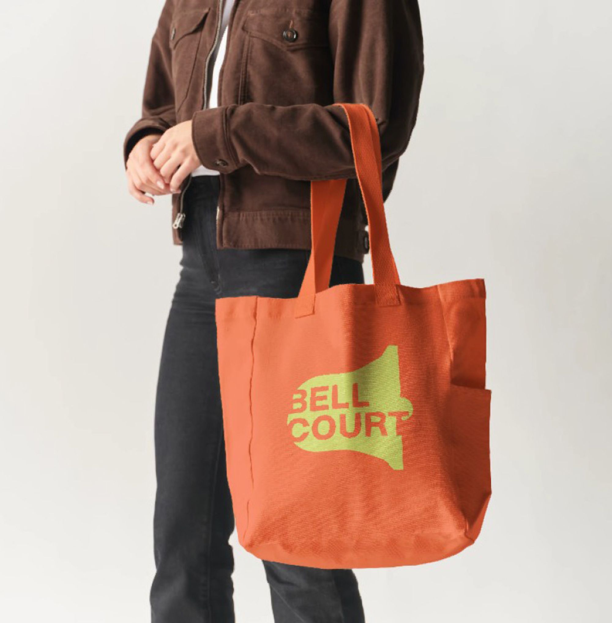
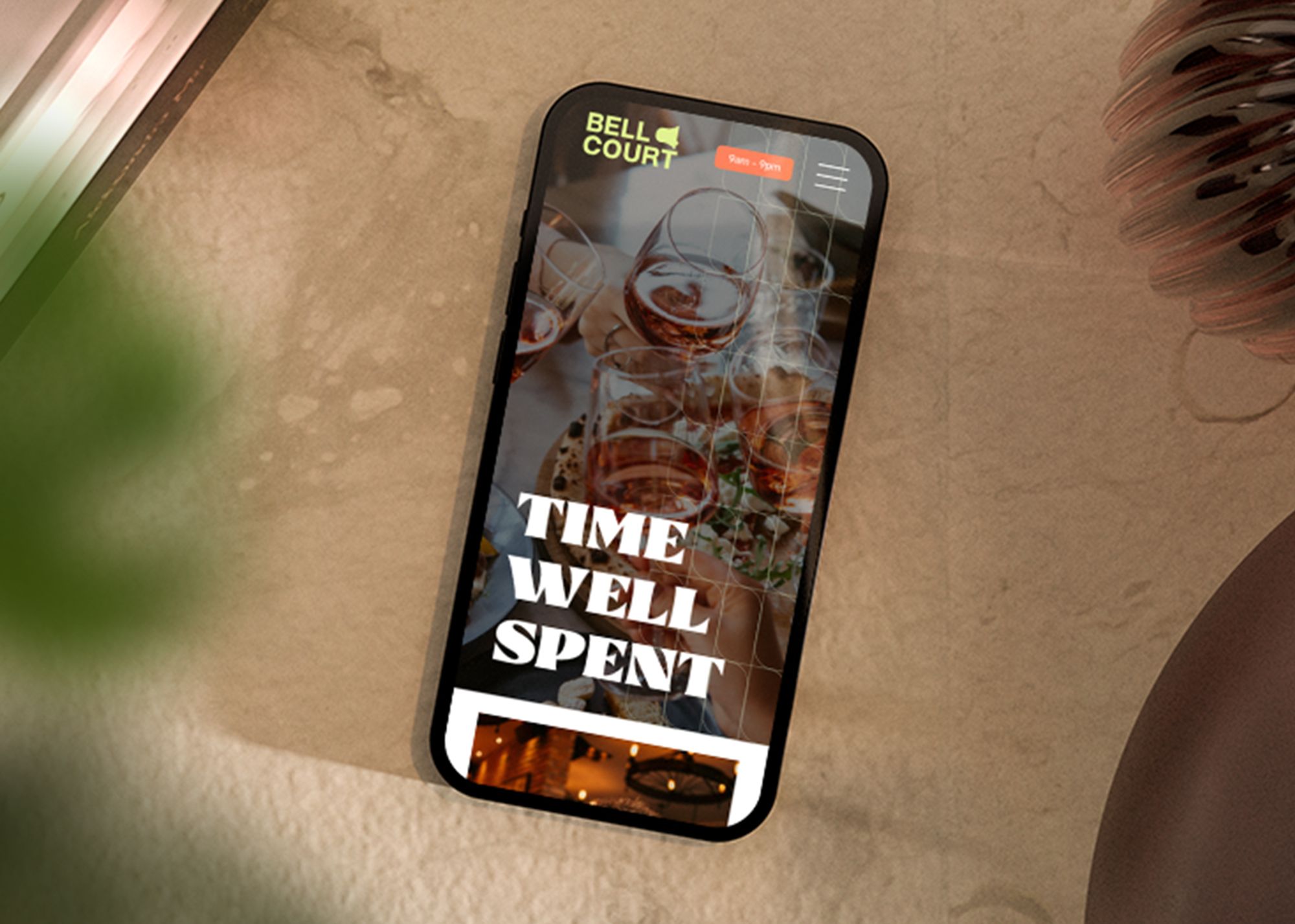
The new brand positions Bell Court to engage a broader, higher-value audience while retaining its established appeal. Improved visibility and wayfinding enhance the on-foot experience, while a cohesive, contemporary identity drives stronger recall – flexing seamlessly across signage, digital and print to support growth and long-term value.
Other Work
22 Bishopsgate
How we brought consistency, creativity and reliability to the UK’s largest office building.

Global Sport Group
How we gave a $14bn sports investment fund a stand out brand.
Canada Water
How we brought new energy and flexibility to the Canada Water brand.