Canada Water
How we brought new energy and flexibility to the Canada Water brand.
Brand Identity, Creative Campaign, Film, Hoardings, OOH Advertising, Storytelling
- Brand Identity
- Creative Campaign
- Film
- Hoardings
- OOH Advertising
- Storytelling
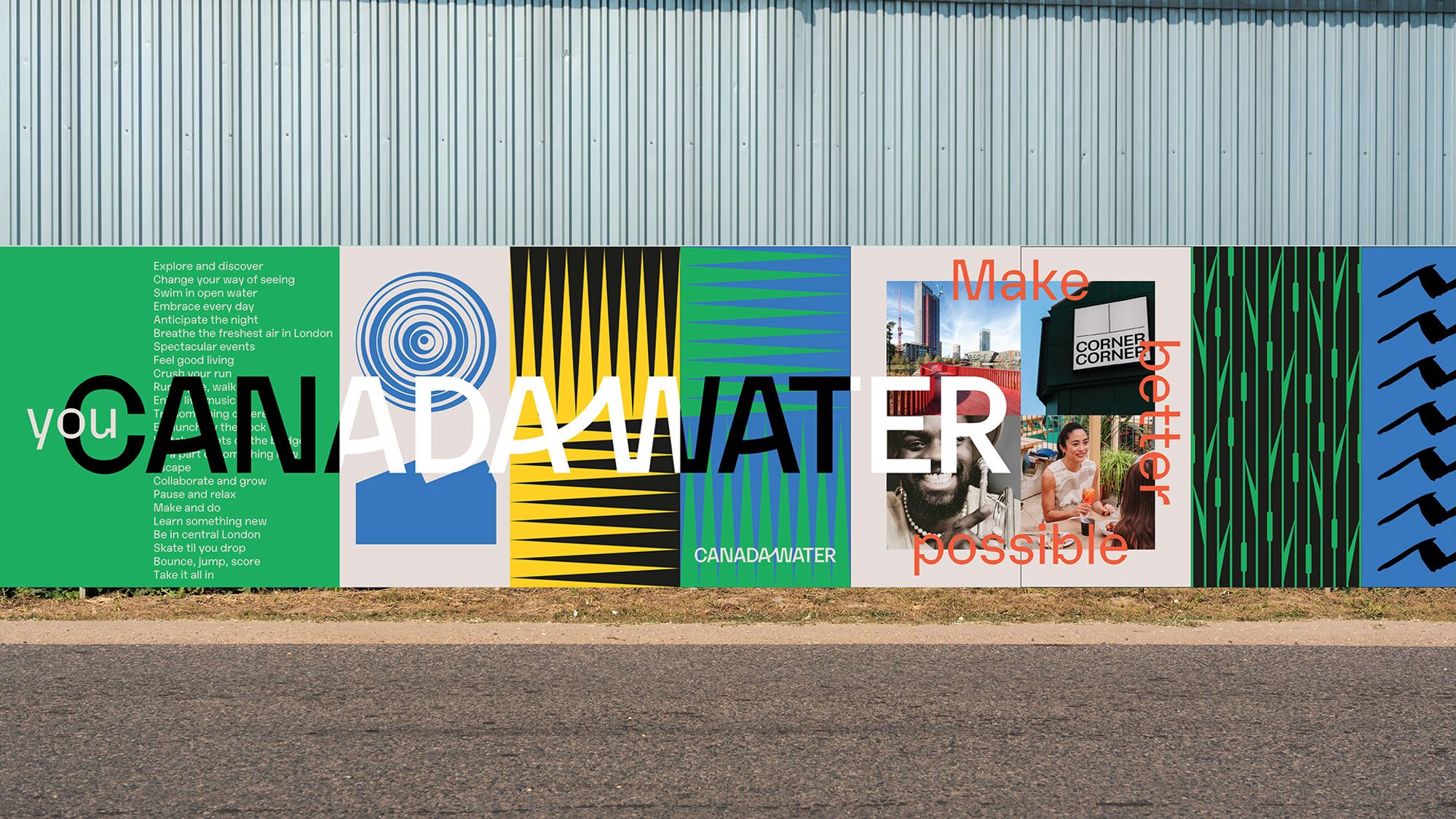
The Problem:
Canada Water is a new, 53 acre sustainable district in London, blending modern workspaces, retail, and green public spaces created by British Land. Their existing brand, although fit for community and public consultation launch, was struggling to flex to a wider corporate audience, for commercial pitches, retail lettings and as a placemaking too to attract a younger, style-savvy audience.
The Story:
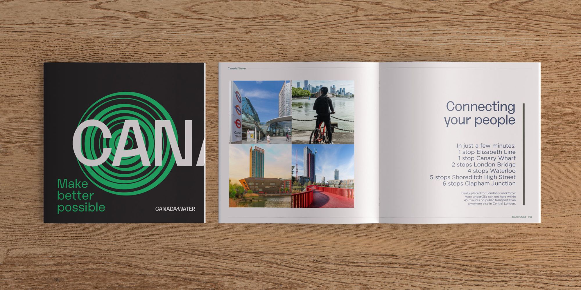
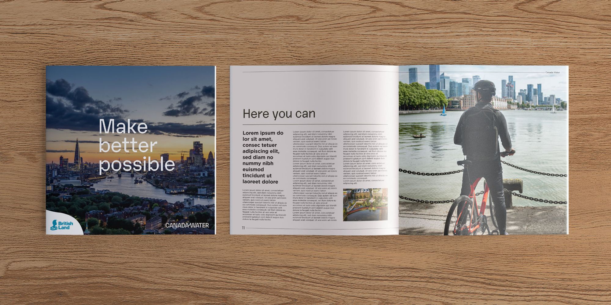
Chocolate were asked to create a new brand, keeping established elements like the logo, but evolving the graphic pack to adapt to different conversations from corporate, B2B, B2C and placemaking.
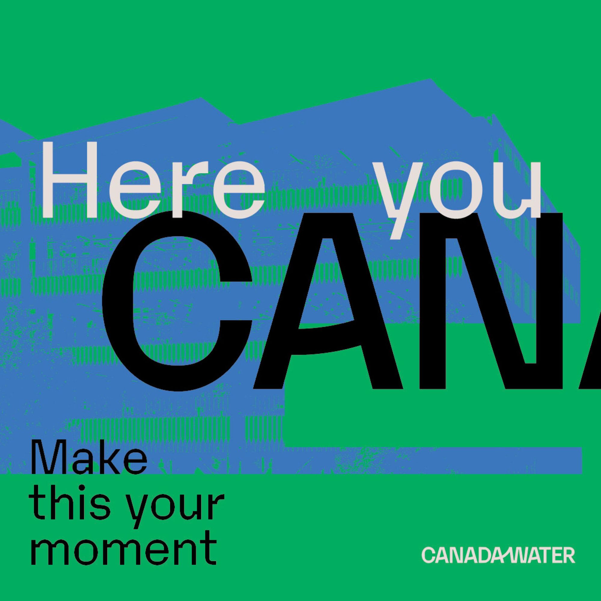
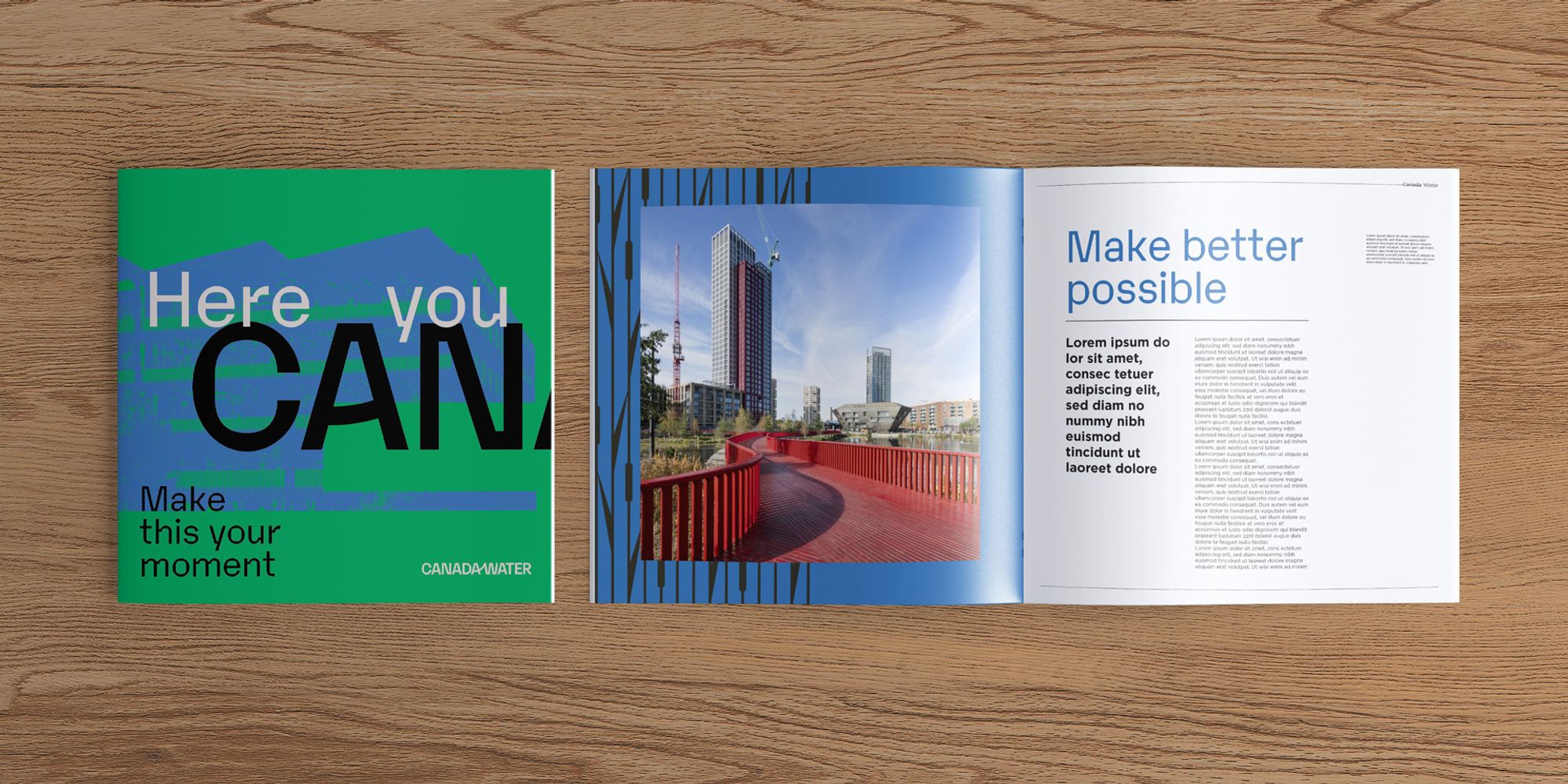
We know this place well. So, we delivered way more than just a brand. We gave at the place a story with depth and gravity: ‘Here you CAN’ describes the infinite opportunities made real to businesses, residents and visitors alike. It’s so very flexible, an answer to every question, and even contains the word that starts the place.
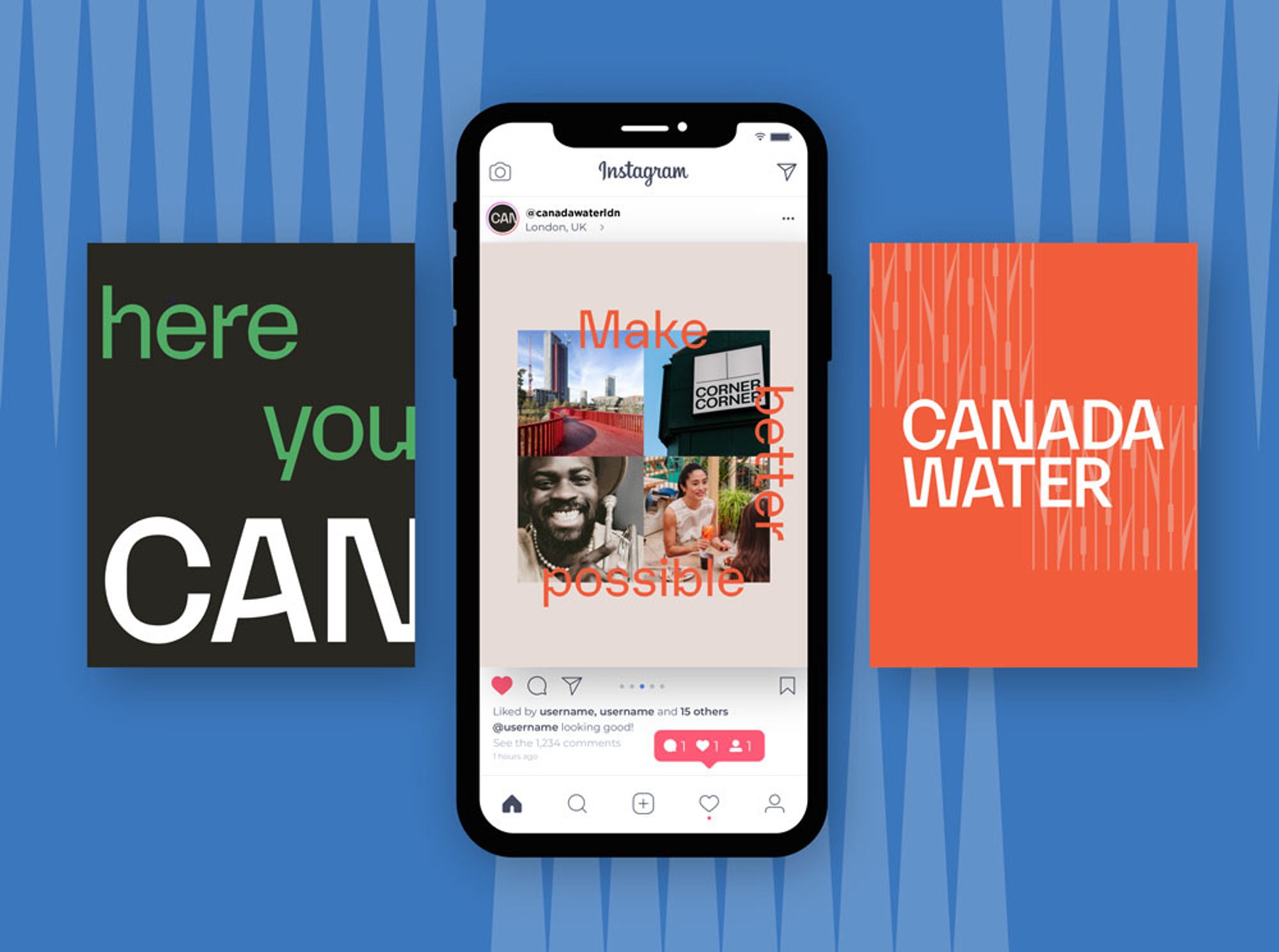
And for the brand… new assets, fonts, patterns, styling, colour ways and photographic options. We even made them a couple of short films to help communicate the reality of completing the initial phase to the market place.
The Result:
A new brand with the ability to flex and change with the audience it needs to communicate with, whilst maintaining a recognisable underlying style and image.
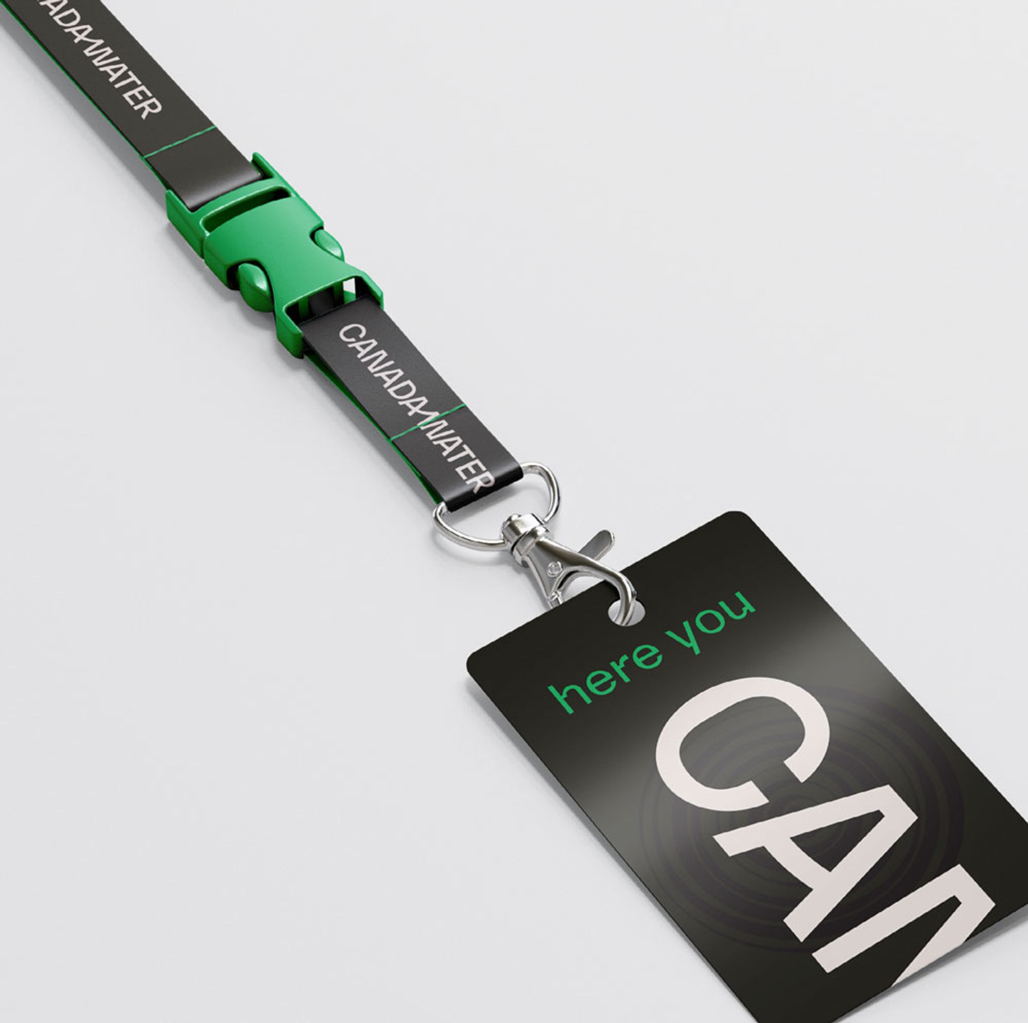
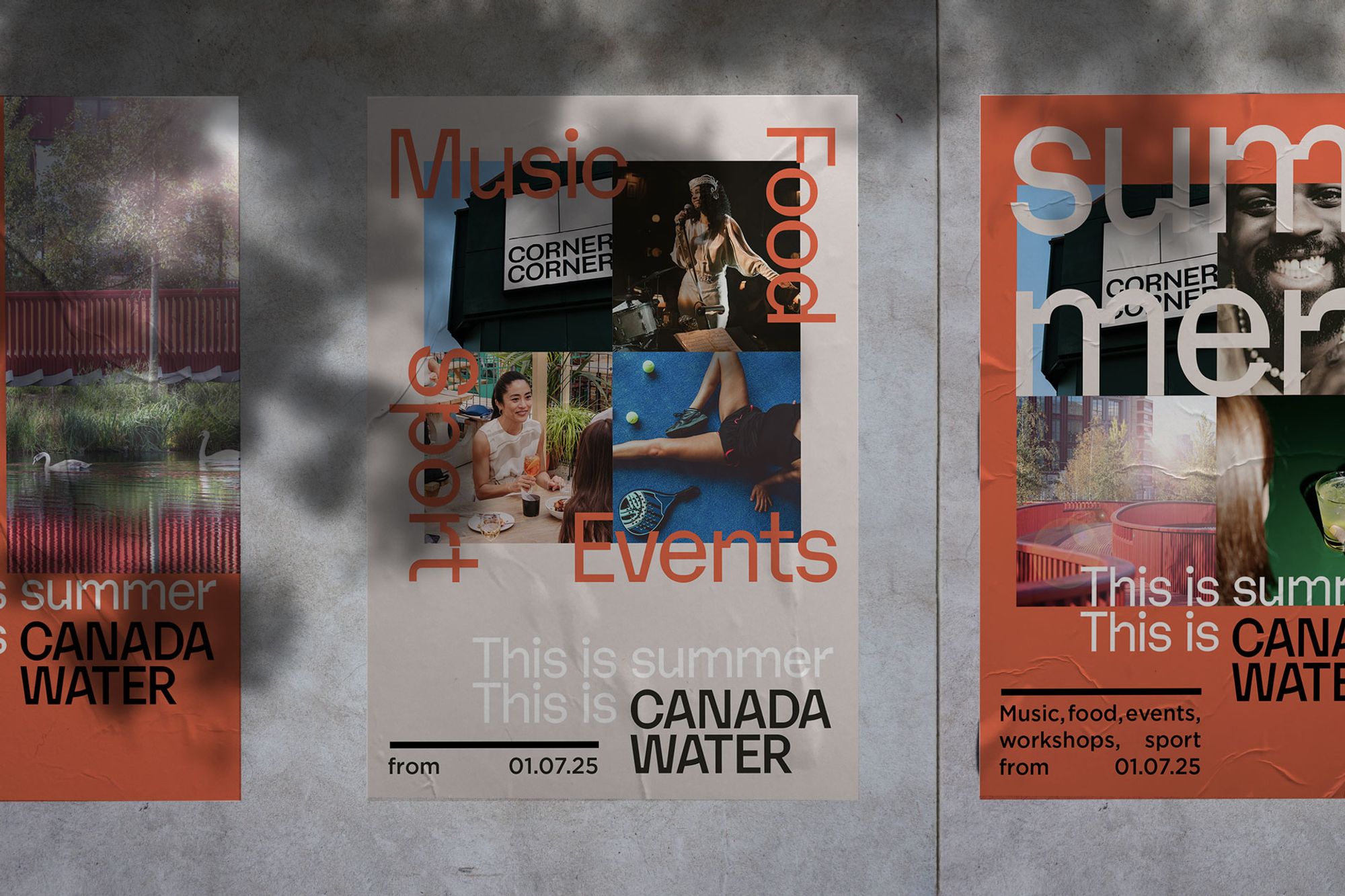
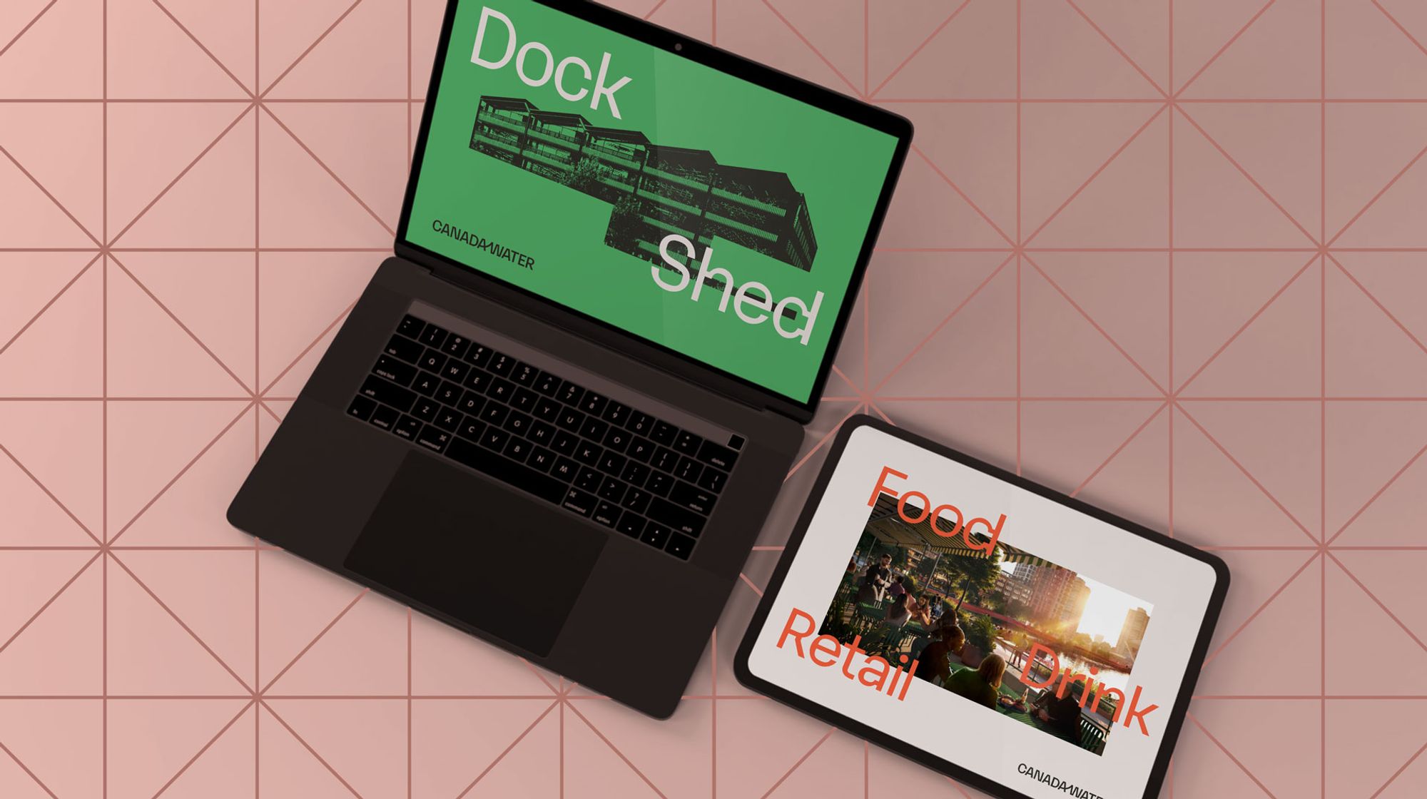
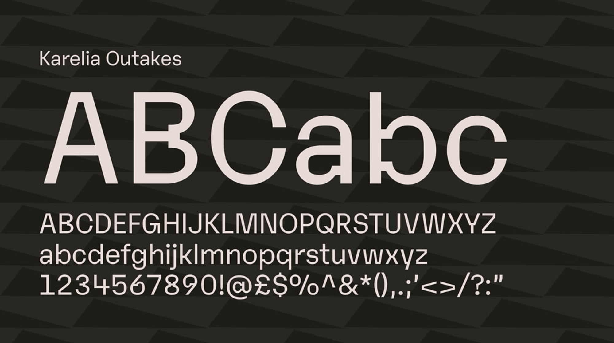
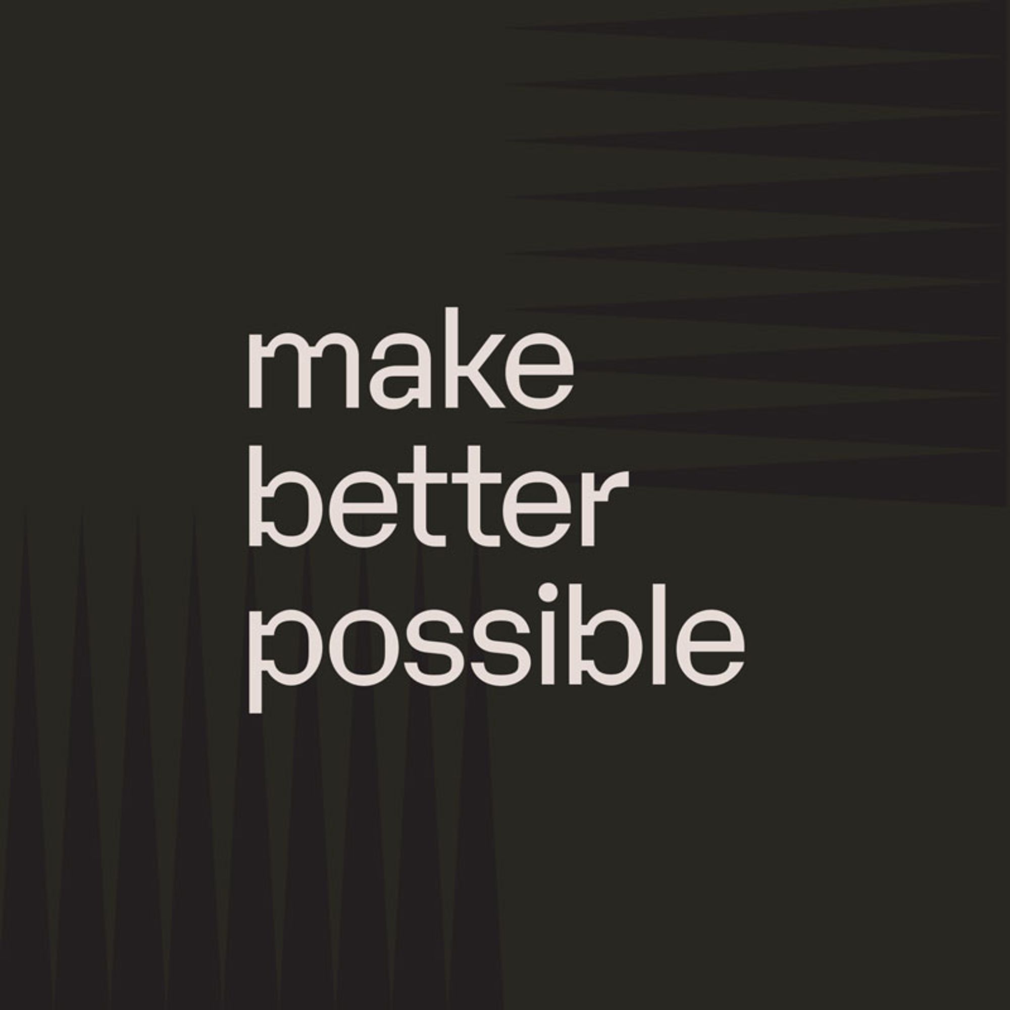
The new brand has the ability to dial down for grown up conversations with potential corporate tenants and planning consultations, then dial up with colours, patterns and heavily stylised photography and film to attract young workers and visitors to choose Canada Water as a place to live or visit. The resulting brand leverages all the raw grit of London’s docklands and captures the energy and promise of what is yet to come.



Other Work
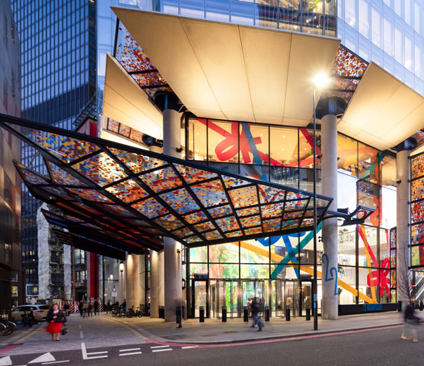
22 Bishopsgate
How we brought consistency, creativity and reliability to the UK’s largest office building.
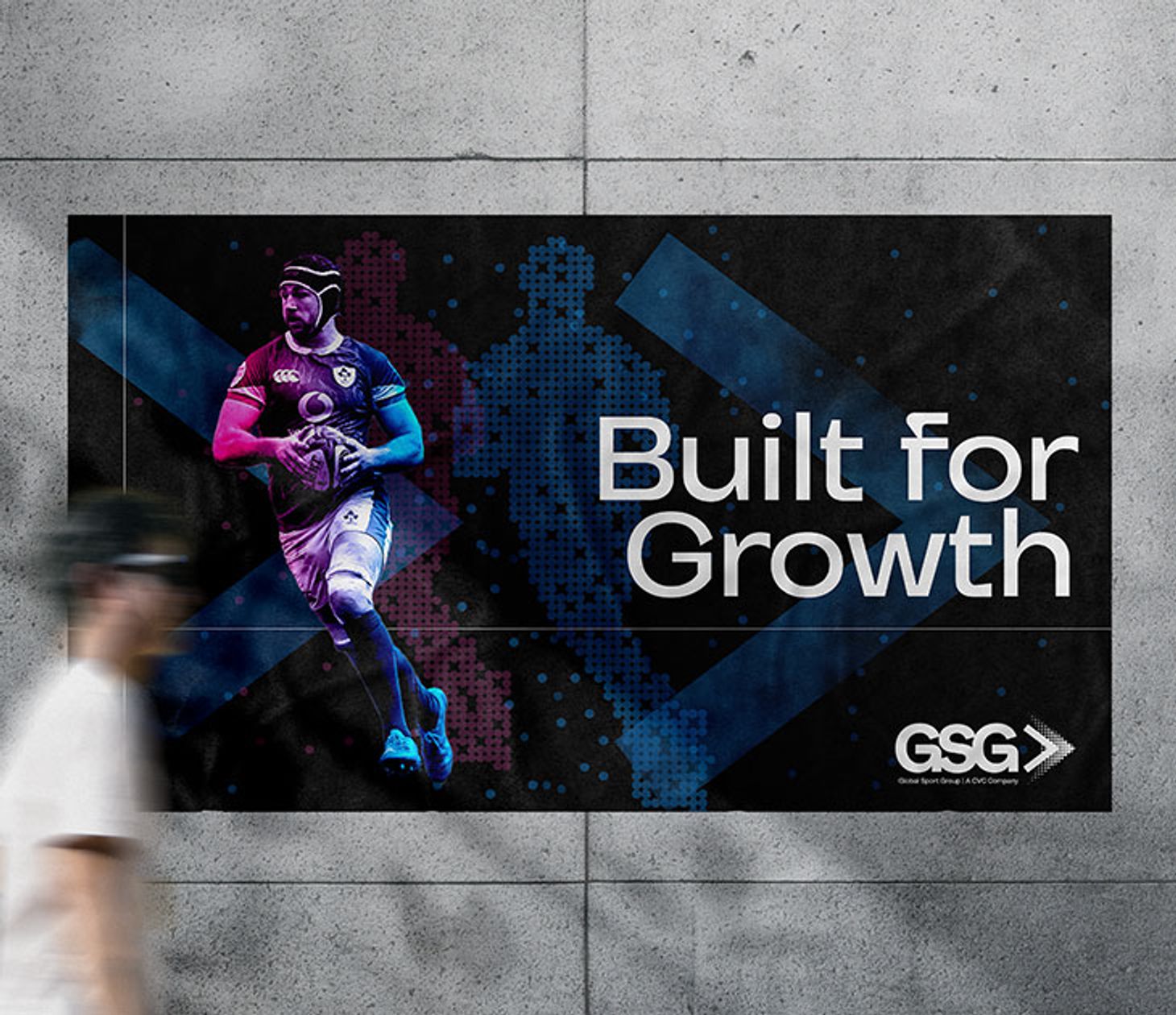
Global Sport Group
How we gave a $14bn sports investment fund a stand out brand.
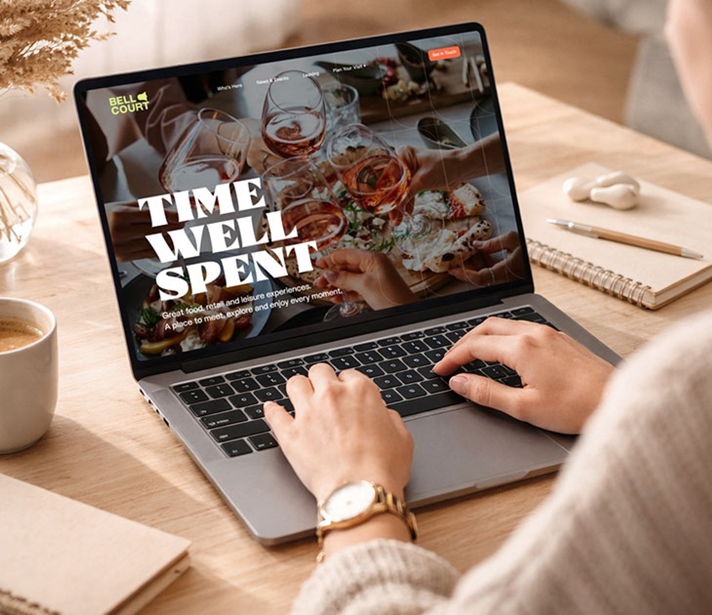
Bell Court
How we gave a new face to Shakespeare’s local market.