Parkside
How we gave a personality to Elephant Park’s final BTR.
Brand Identity, Creative Campaign, Film, Photography, Signage, Storytelling
- Brand Identity
- Creative Campaign
- Film
- Photography
- Signage
- Storytelling
The Problem:
Having successfully taken 2 premium, and one luxury apartment block to market it was time to get back to basics. Our client’s final offer, ‘Parkside’ lacked the spectacular views and some of the amenity spaces of the previous assets. So we needed a brand that would connect the offer to our audience through service and personality.
The Story:
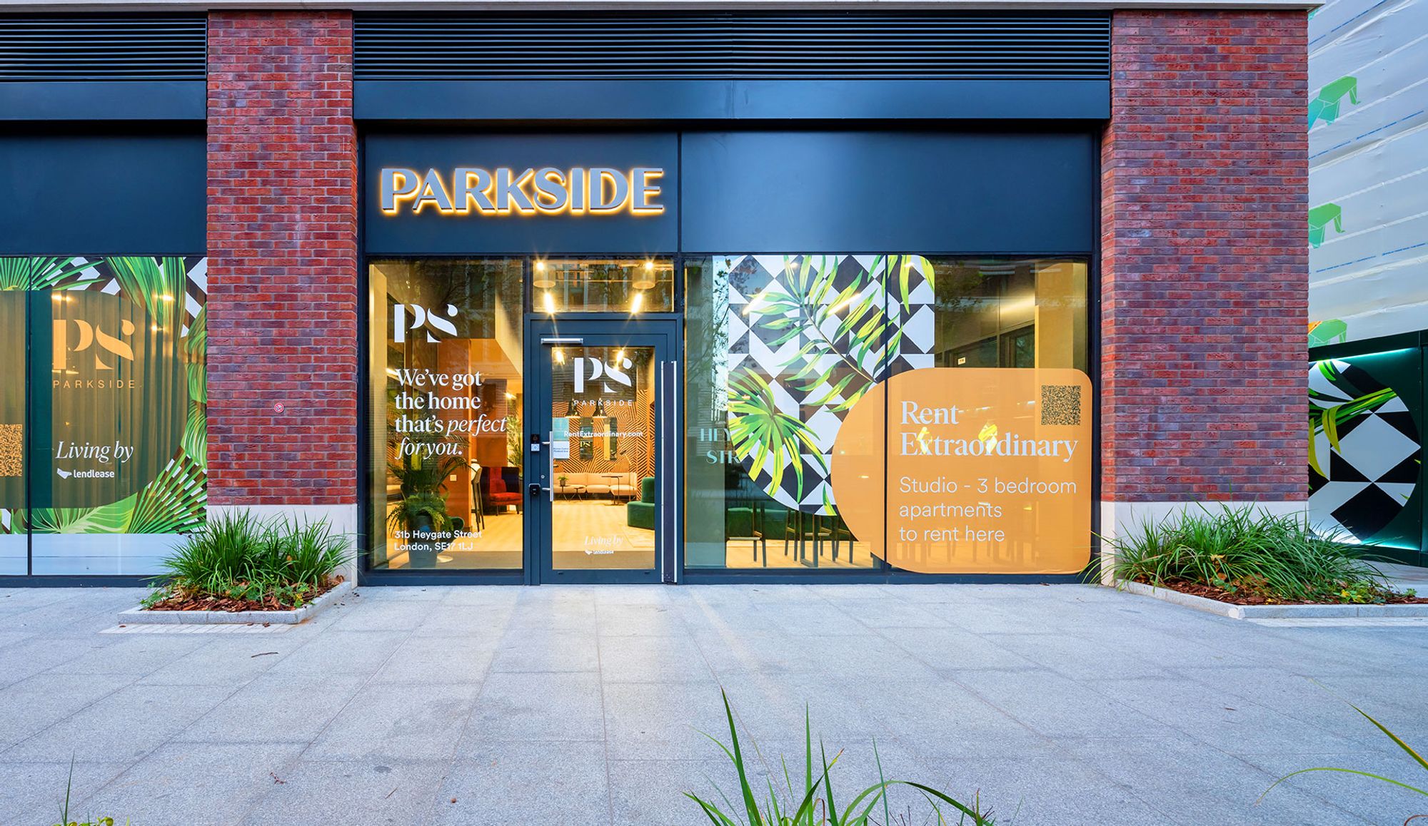
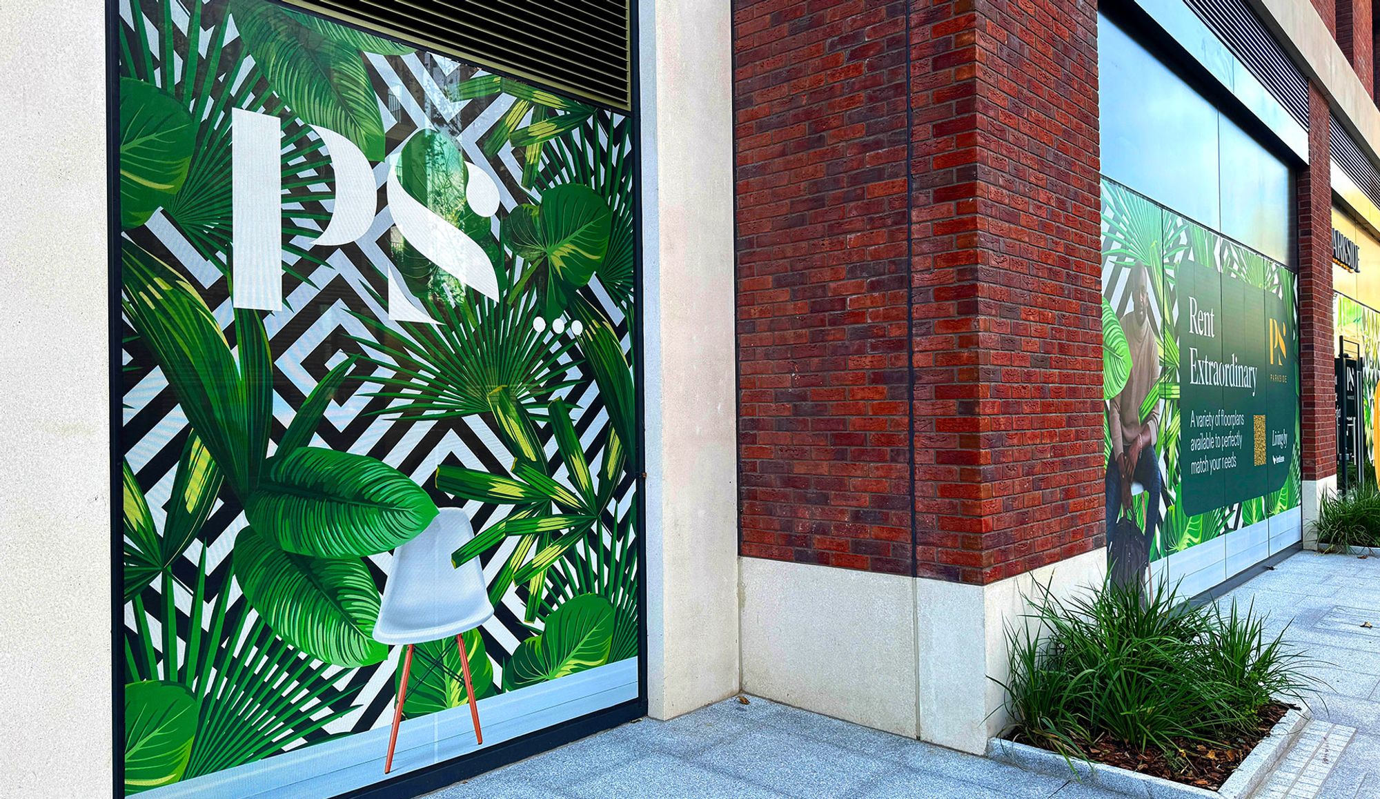
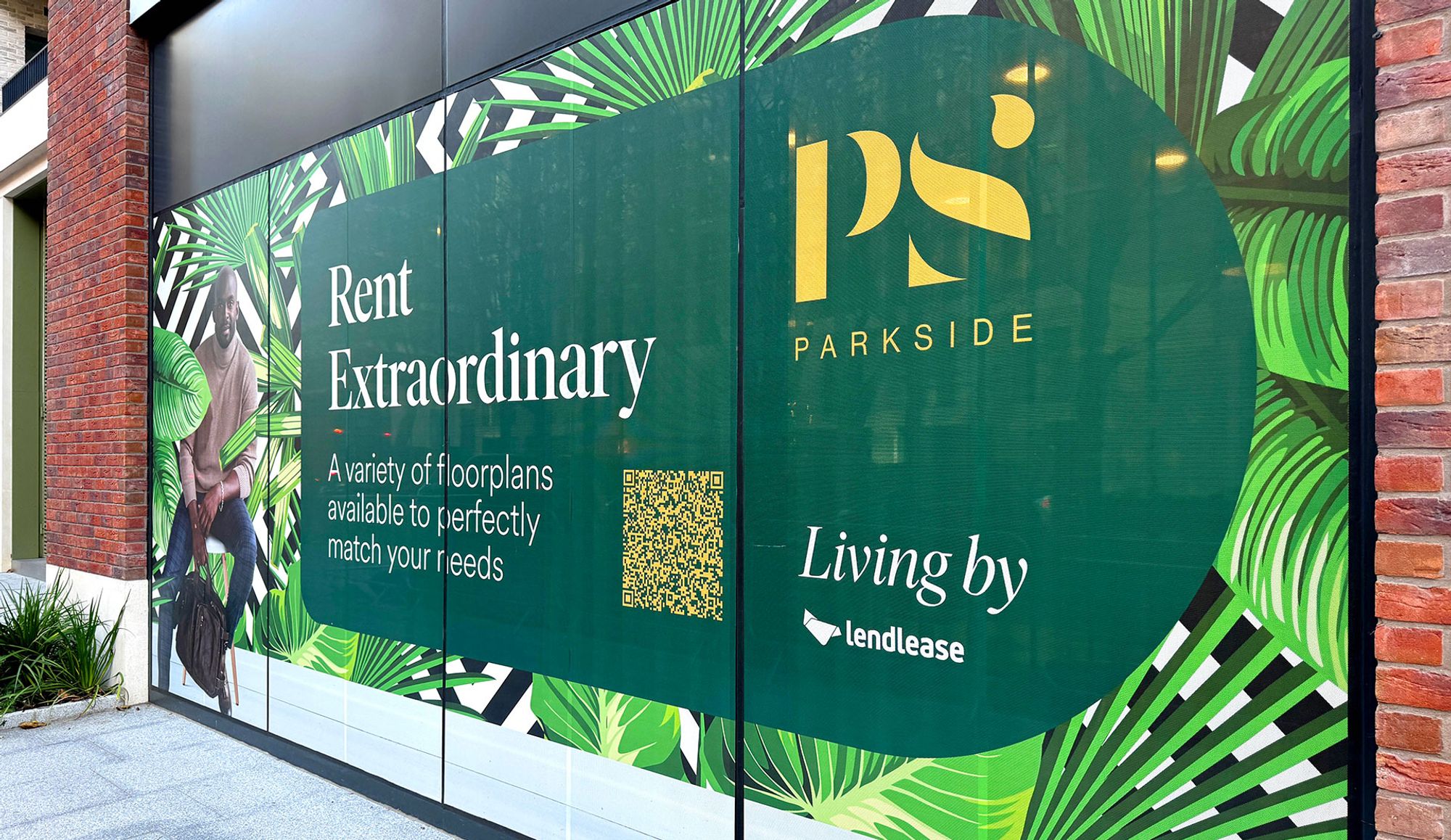
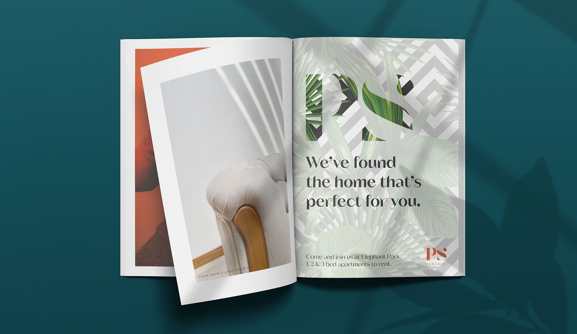
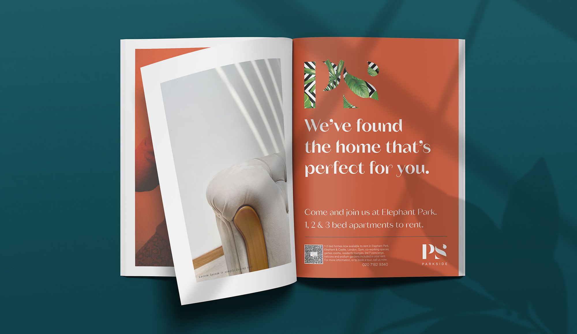
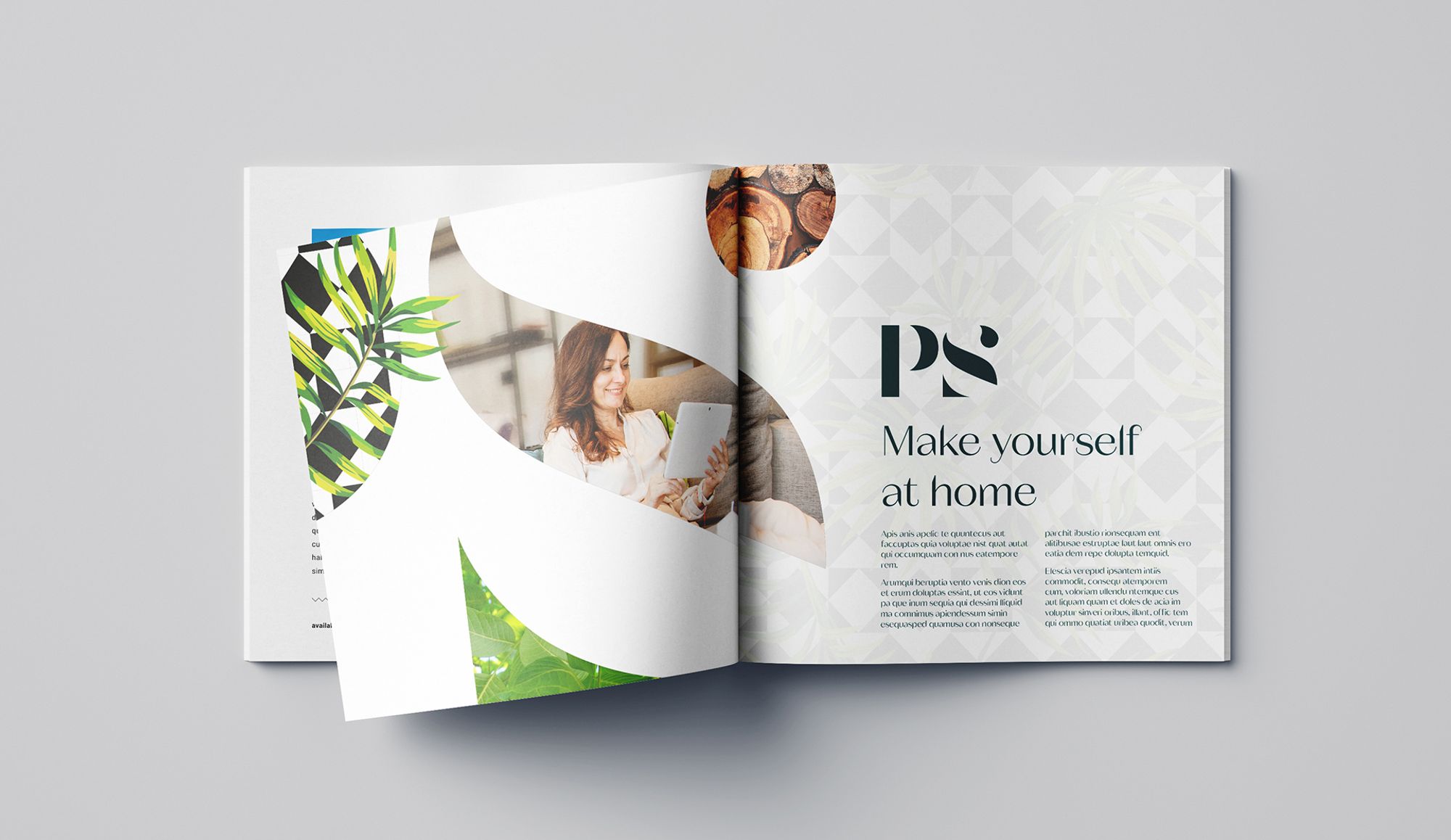
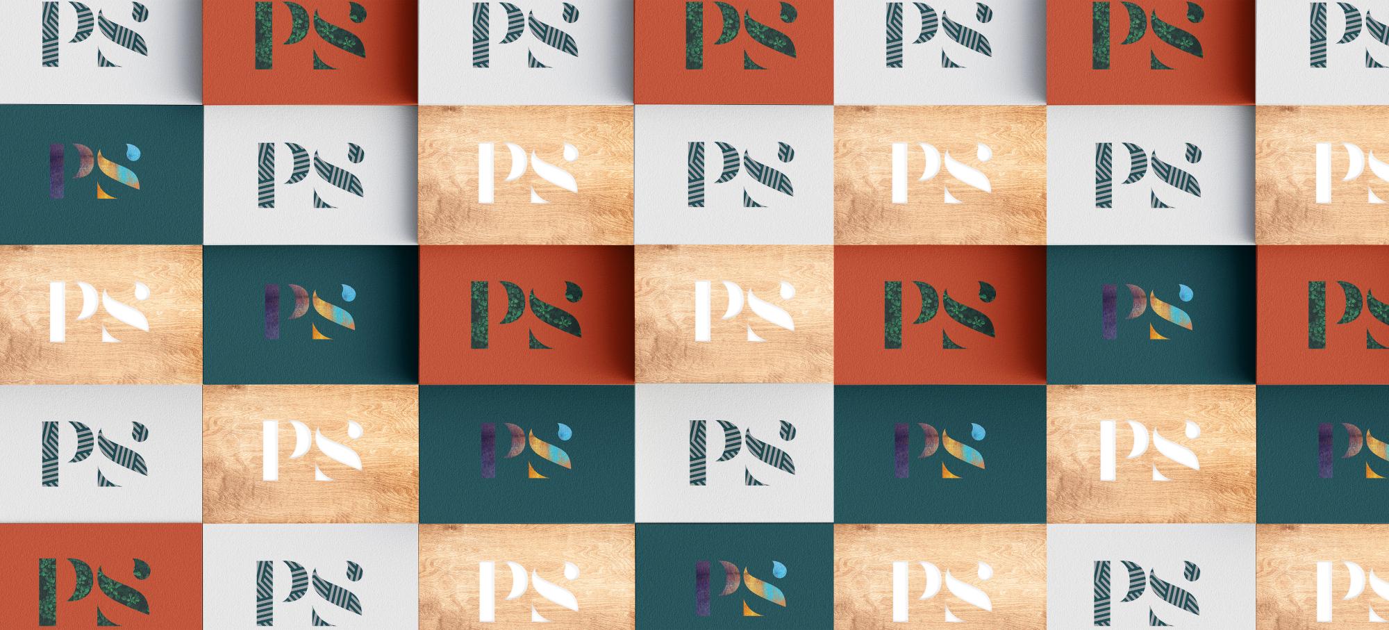
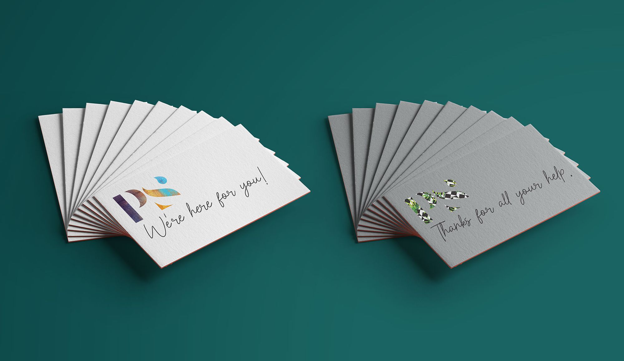
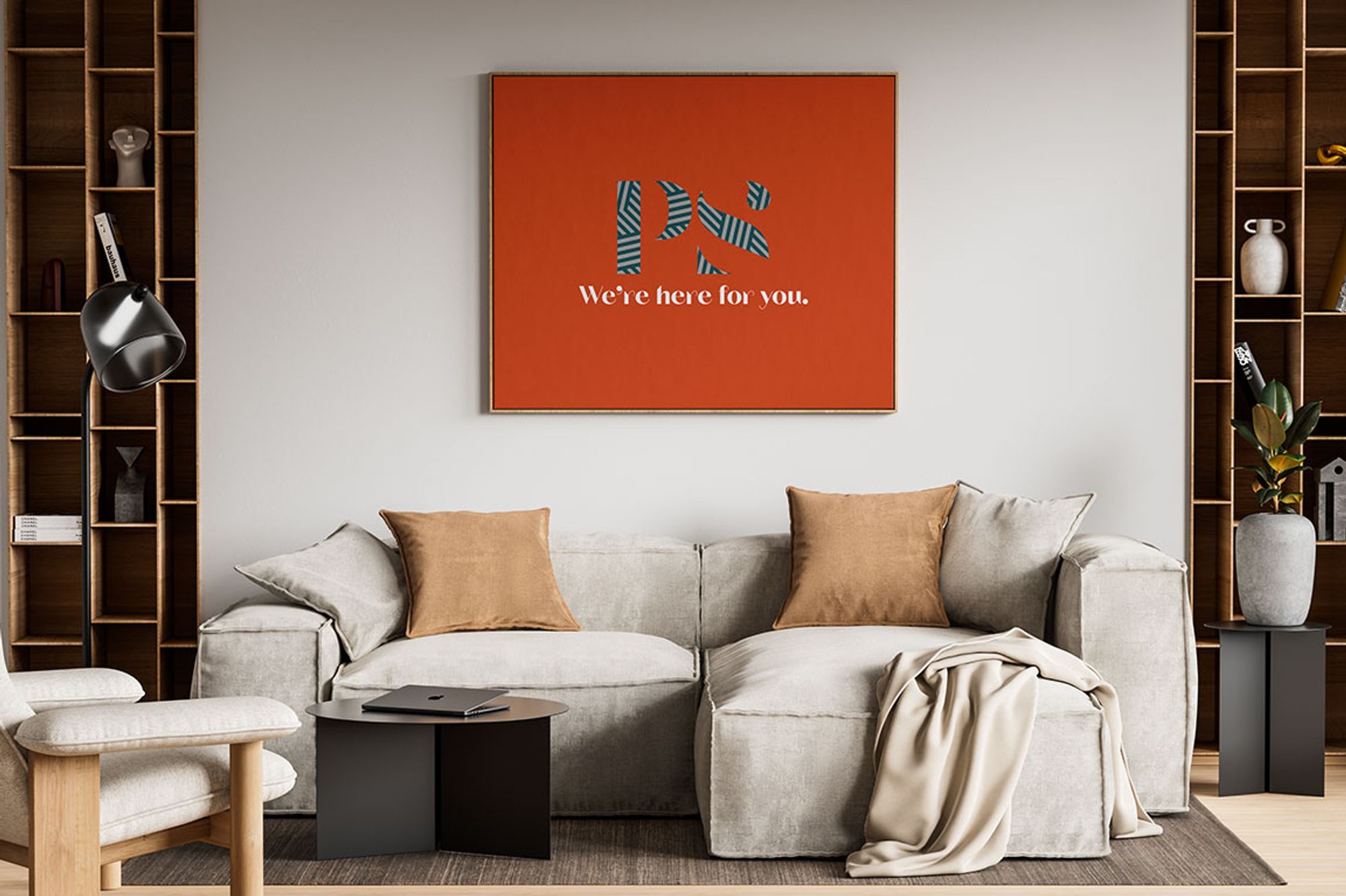
‘Parkside’ was a given. Simple and to the point, but not unusual. So we split the words and created a contemporary monogram logo device, more suited to our younger audience. This gave us ‘PS’ – our story.
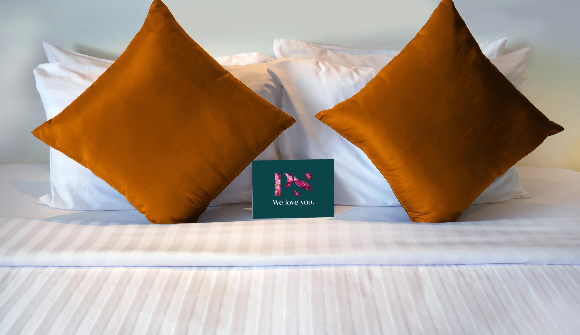
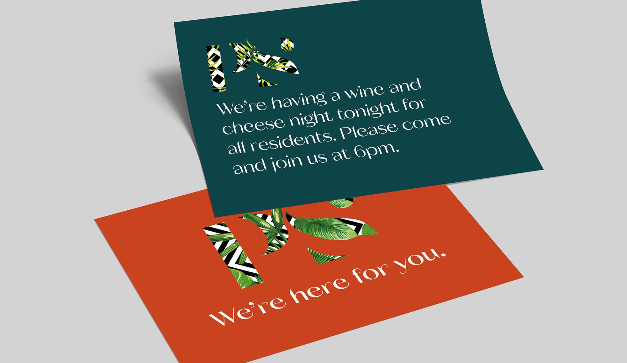
PS is the note you leave after a conversation. The promise, the added value. It allows you to tell your audience that you care, makes every output personal and helps to leverage all of the little extras that our tenants receive by renting at Parkside. It screams service and attention to detail. All delivered with a confident charm and warmth.
The Result:
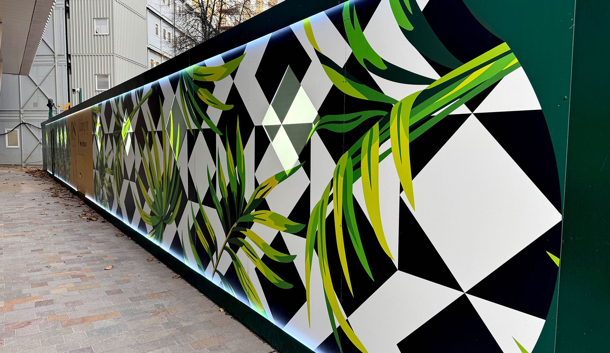
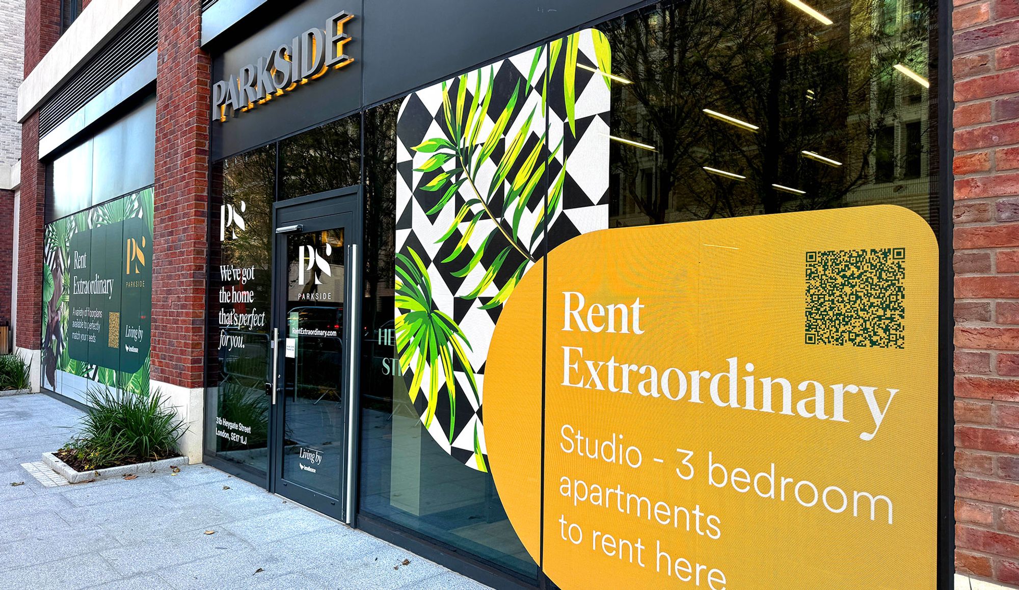
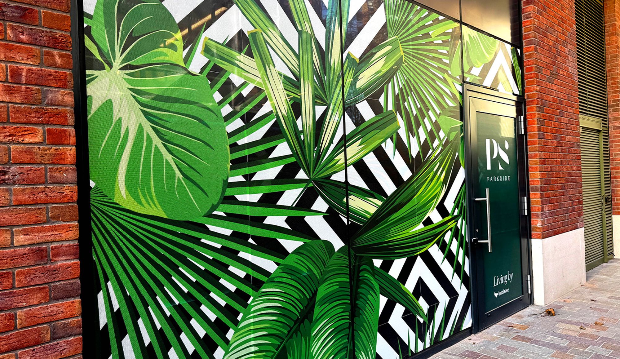
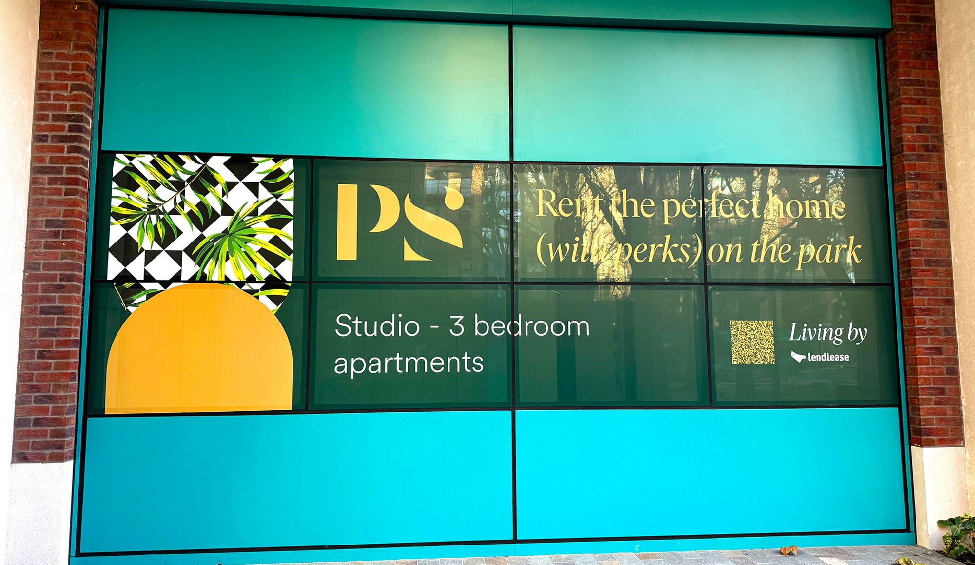
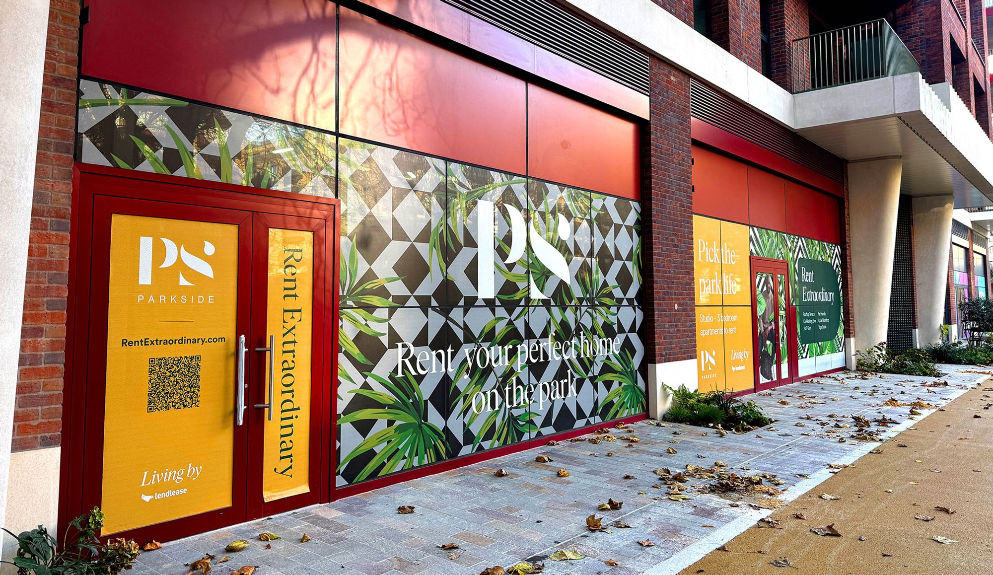
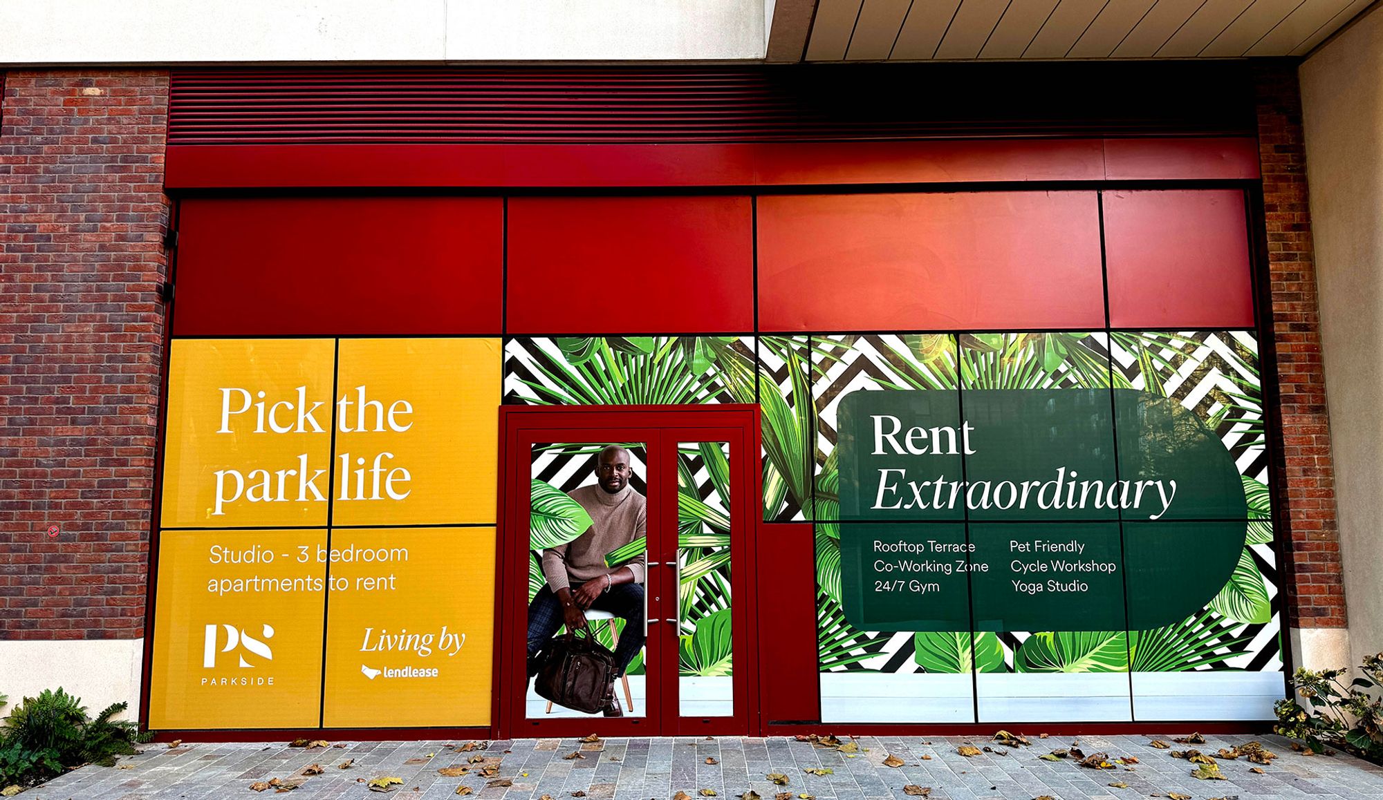
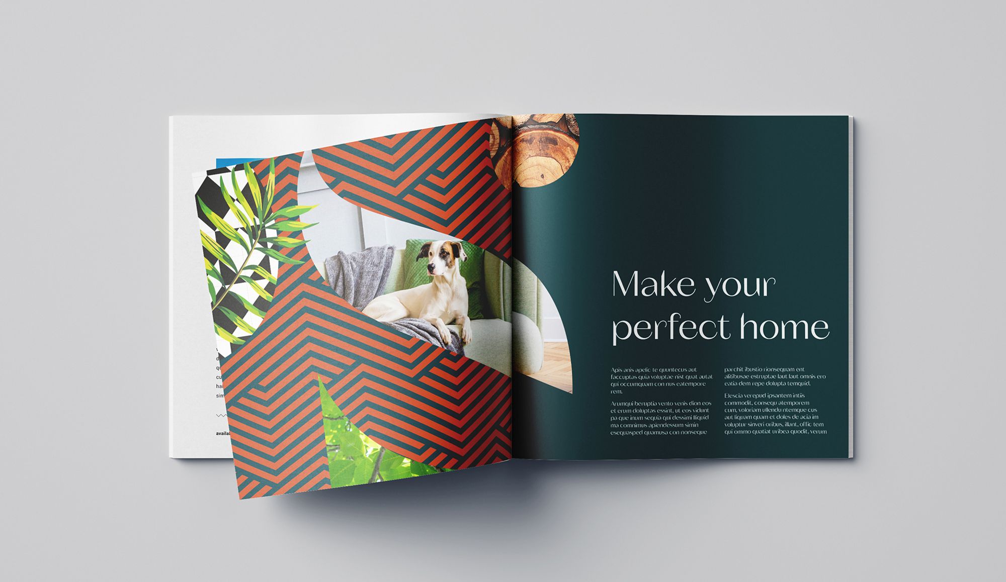
We linked brand to place with a series of patterns turned to wallpapers within common areas. The friendly/quirky tone of voice extended to OOH advertising, window vinyls and hoarding which featured ‘Instagramable’ opportunities, further reflecting brand ethos. As a result; rentals are, once again, outperforming the rest of the market.
Other Work
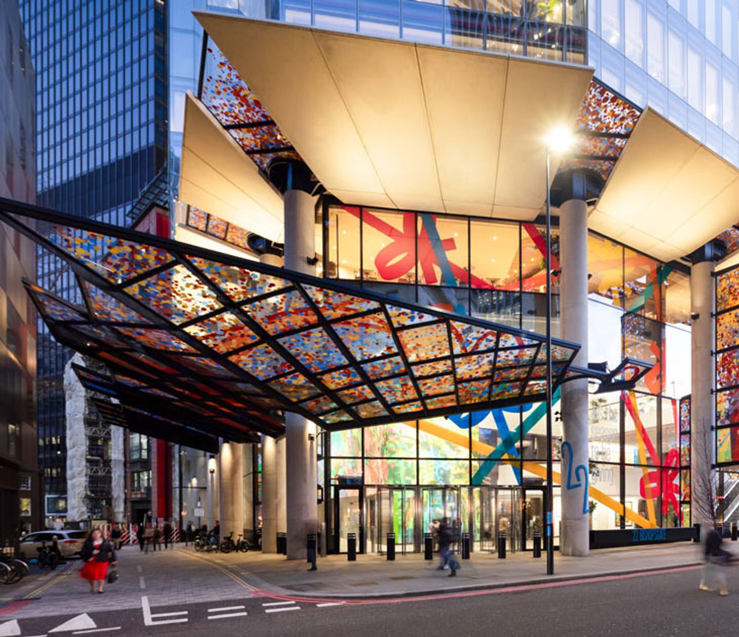
22 Bishopsgate
How we brought consistency, creativity and reliability to the UK’s largest office building.
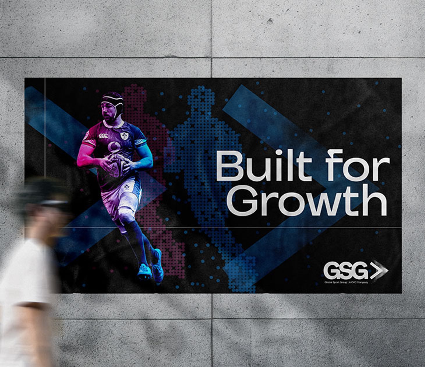
Global Sport Group
How we gave a $14bn sports investment fund a stand out brand.
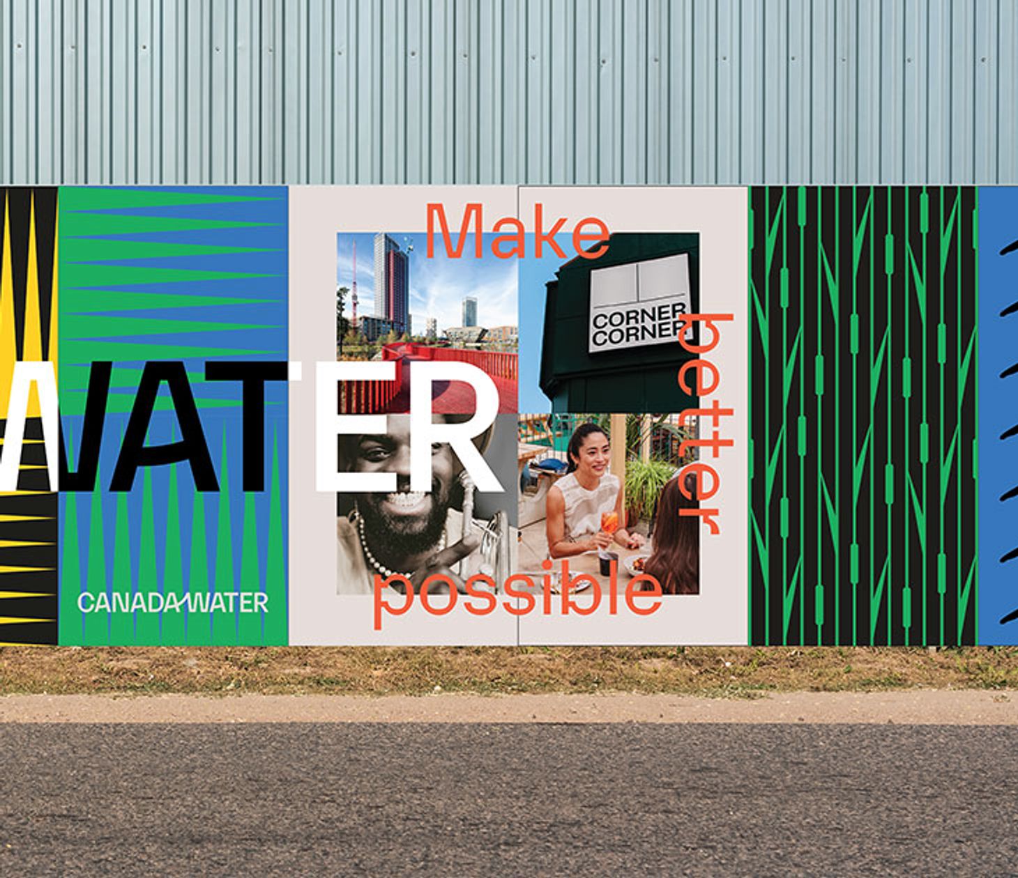
Canada Water
How we brought new energy and flexibility to the Canada Water brand.